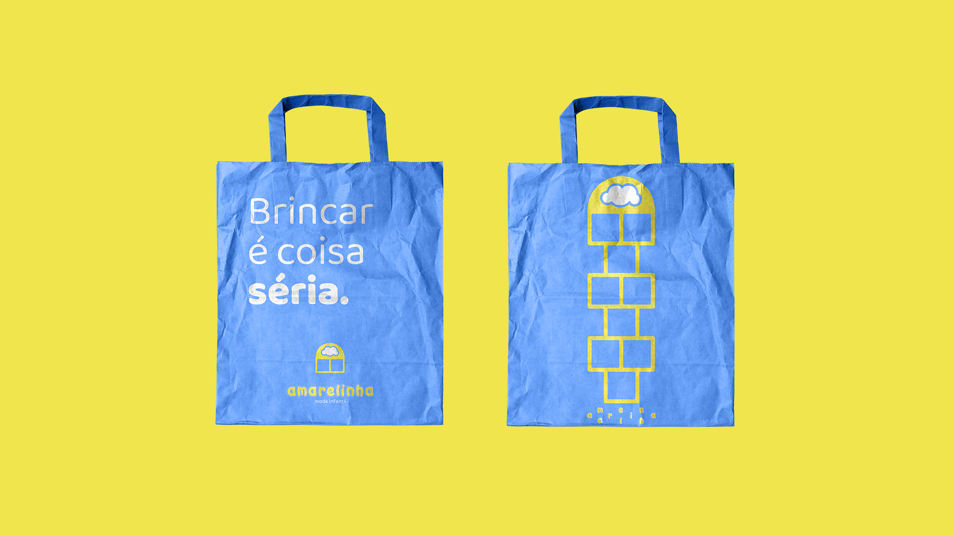

Amarelinha - moda infantil
PT
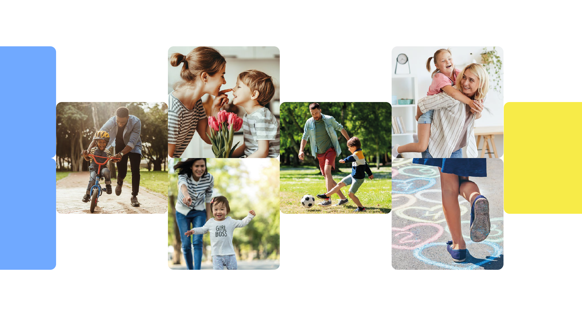
A Amarelinha nasceu com o intuito de atender os pais que se preocupam em manter seus pequenos bem vestidos mesmo em meio às diversões diárias, às brincadeiras e aventuras que os pimpolhos adoram viver.
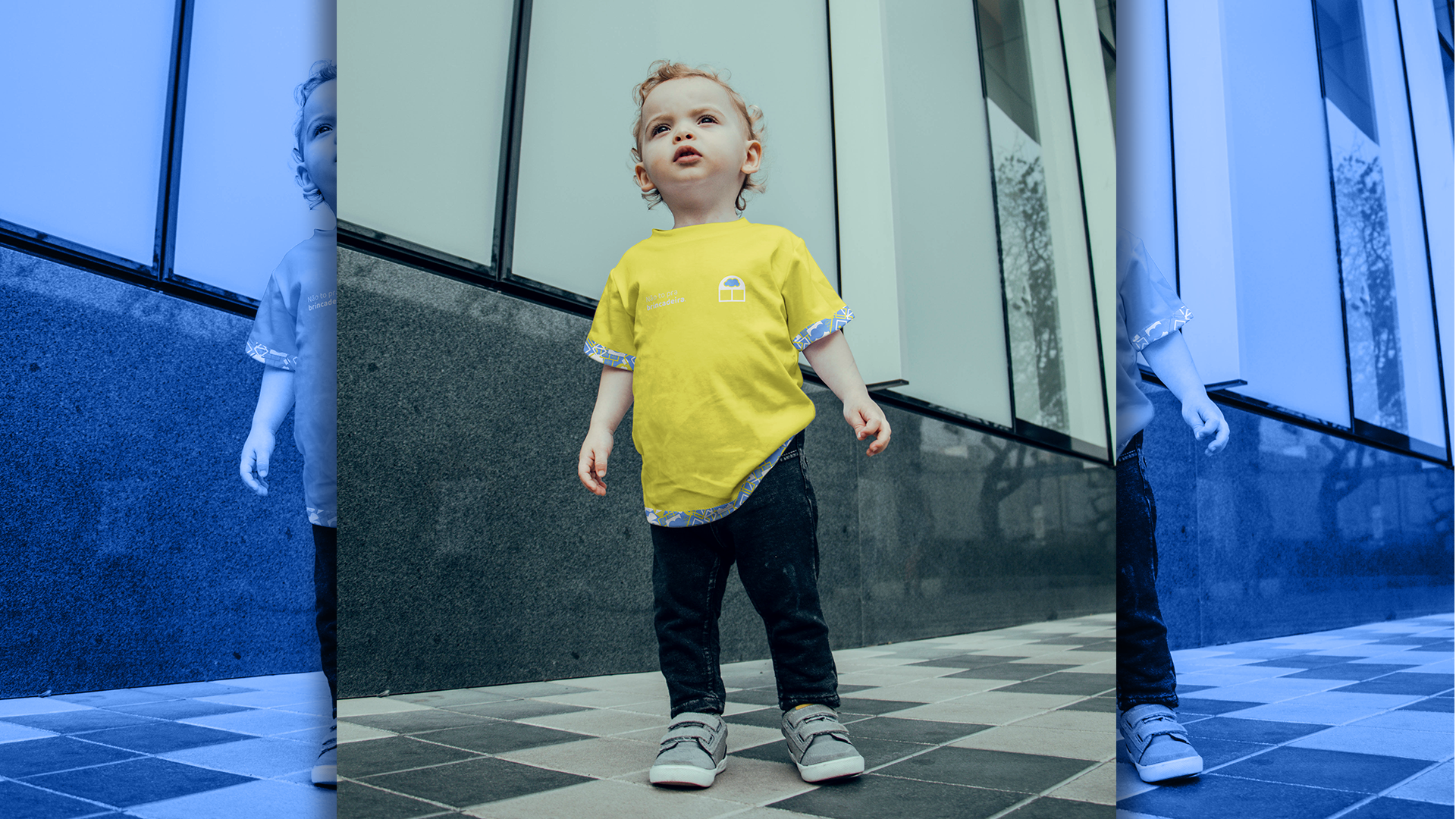
Com roupas para crianças de até 8 anos, a Amarelinha traz versatilidade, estilo e diversão em seus produtos, oferecendo uma experiência de usuário voltada para papais e aos "filhotinhos de gente".
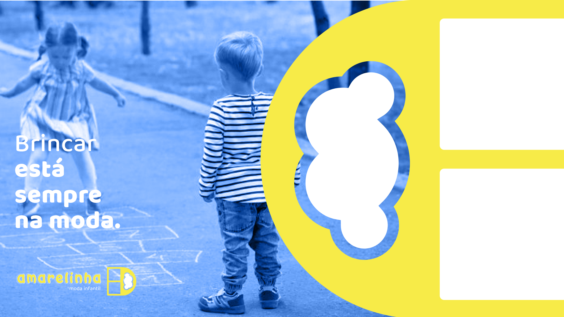
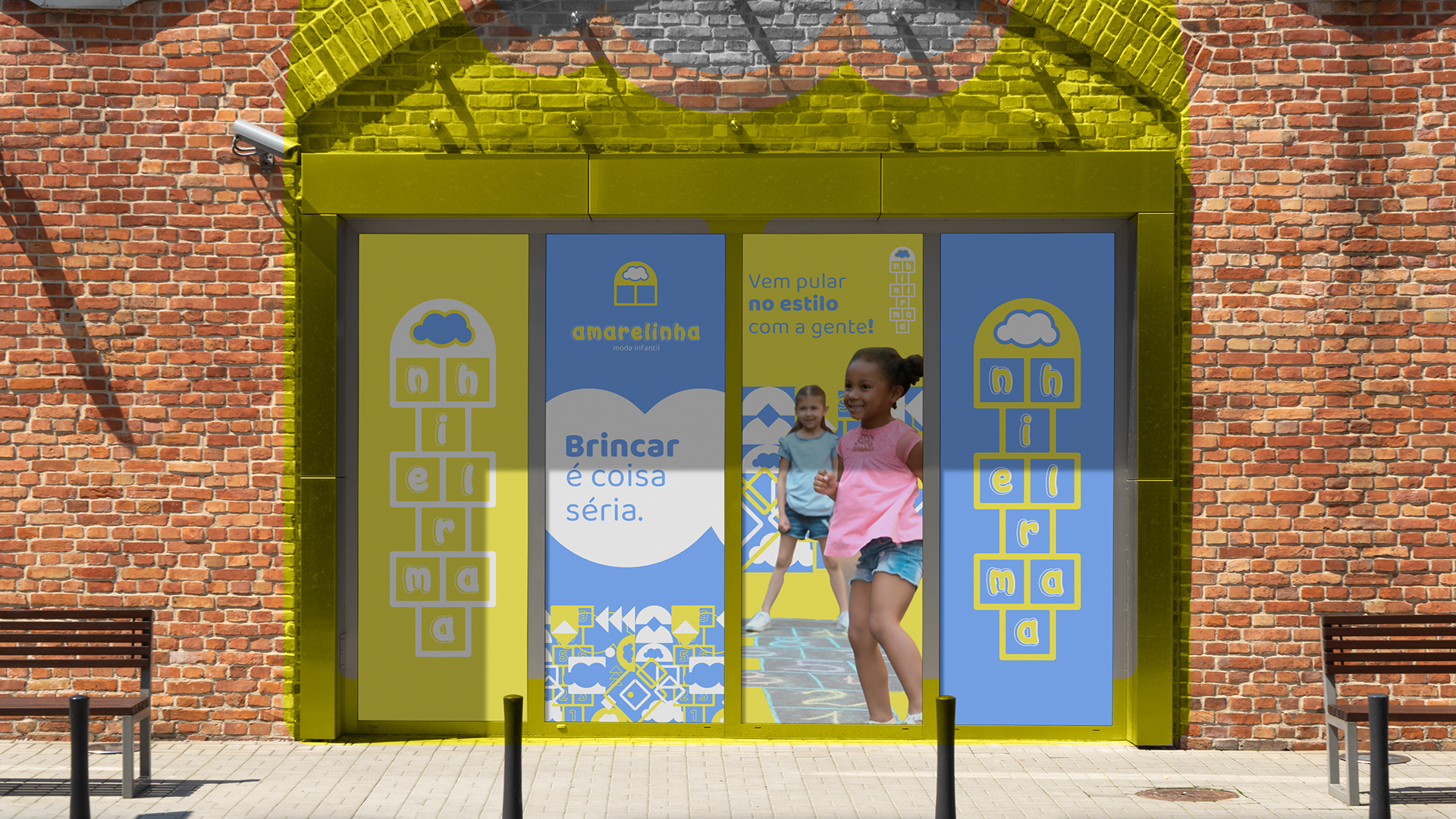
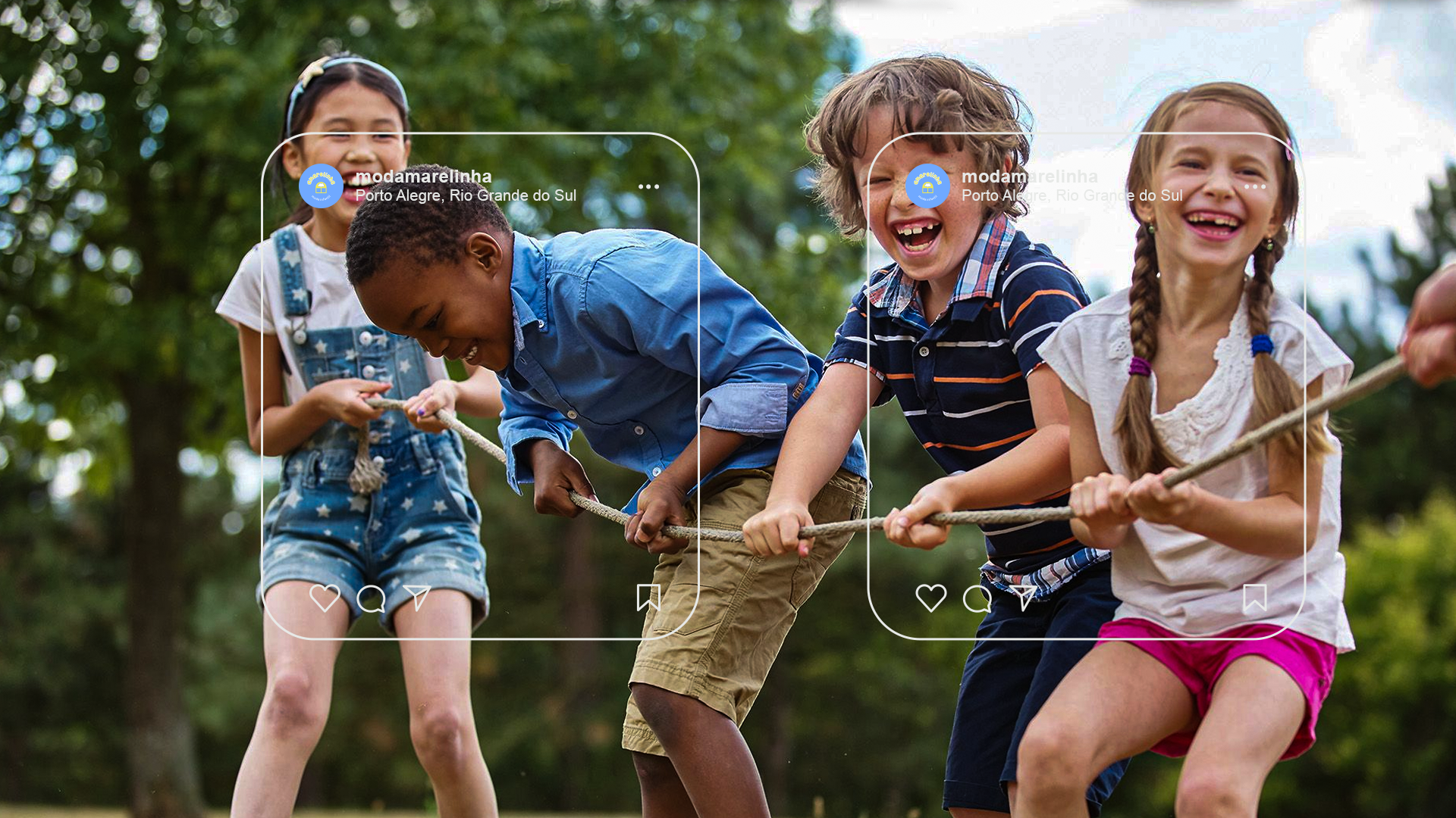
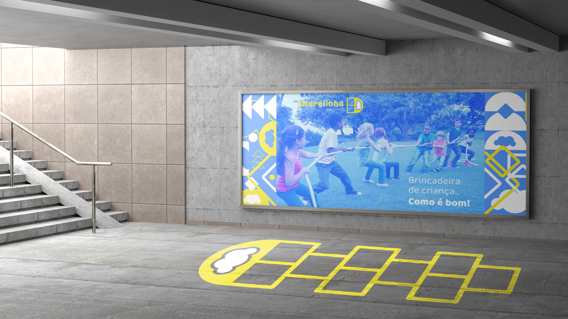
Quem entende que brincar é coisa séria e que a diversão merece estilo e conforto vem pular na Amarelinha.
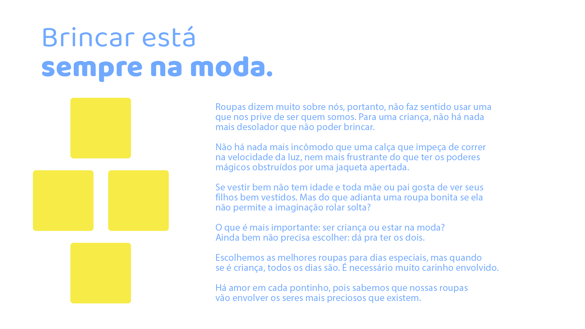
Brincar está sempre na moda.
__
EN
Amarelinha was born with the aim of serving parents who are concerned about keeping their little ones well dressed even in the midst of daily entertainment, games and adventures that pimpolhos love to live.
With clothes for children up to 8 years old, Amarelinha brings versatility, style and fun to its products, offering a user experience designed for daddies and "children of people".
Anyone who understands that games are serious and that fun deserves style and comfort come to Hopscotch.
Playing is always in fashion.
PT
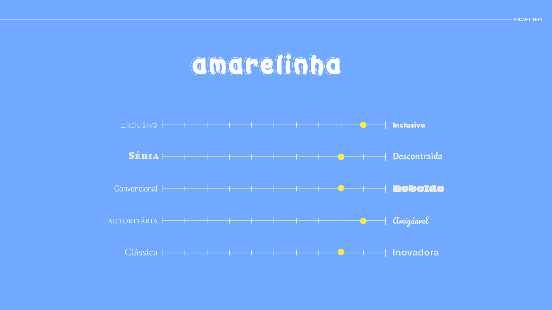
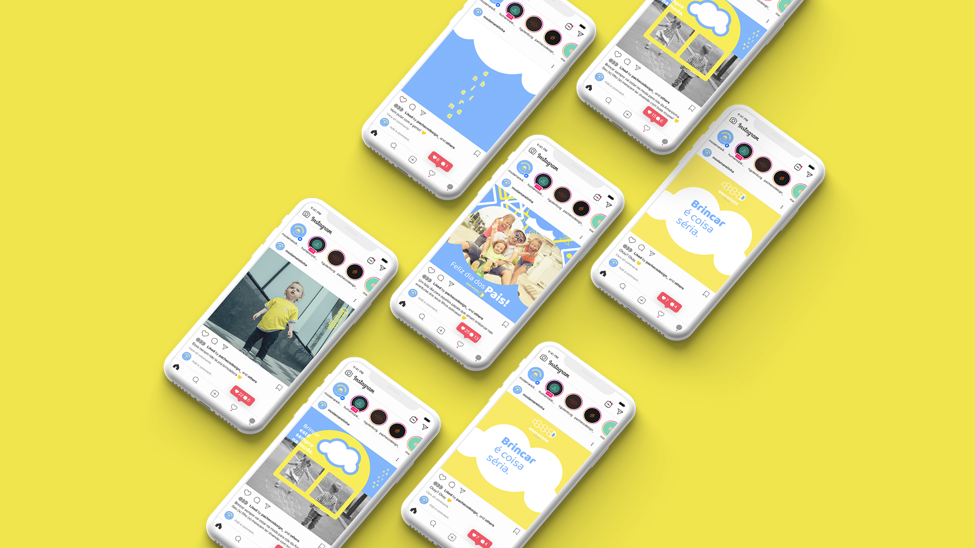
Tratando-se de uma loja que oferece produtos para crianças, mas cujo público-alvo são os pais/responsáveis, a comunicação da marca deve se situar entre esses dois extremos, trazendo clareza sobre o que se trata para os adultos e apresentando diversão e bons momentos para os pequenos.
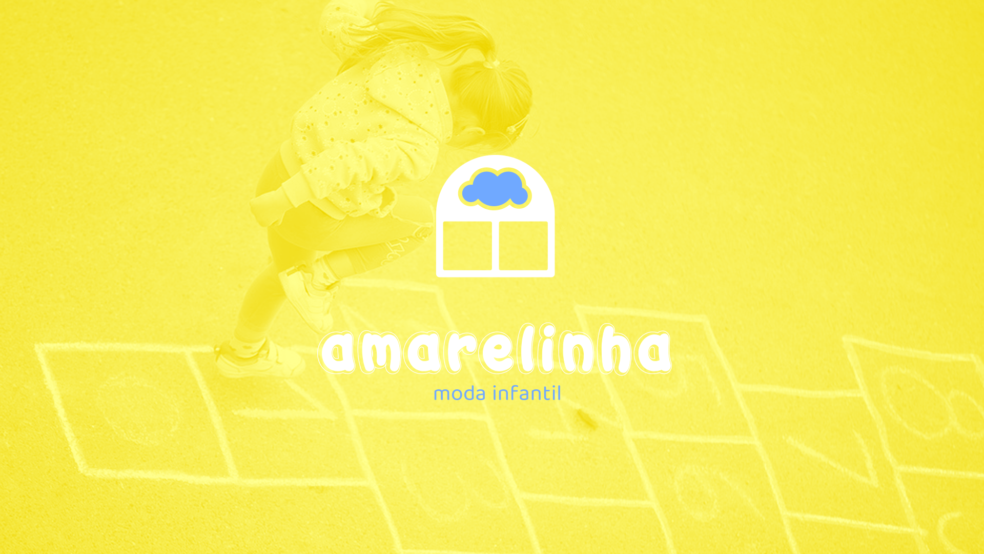
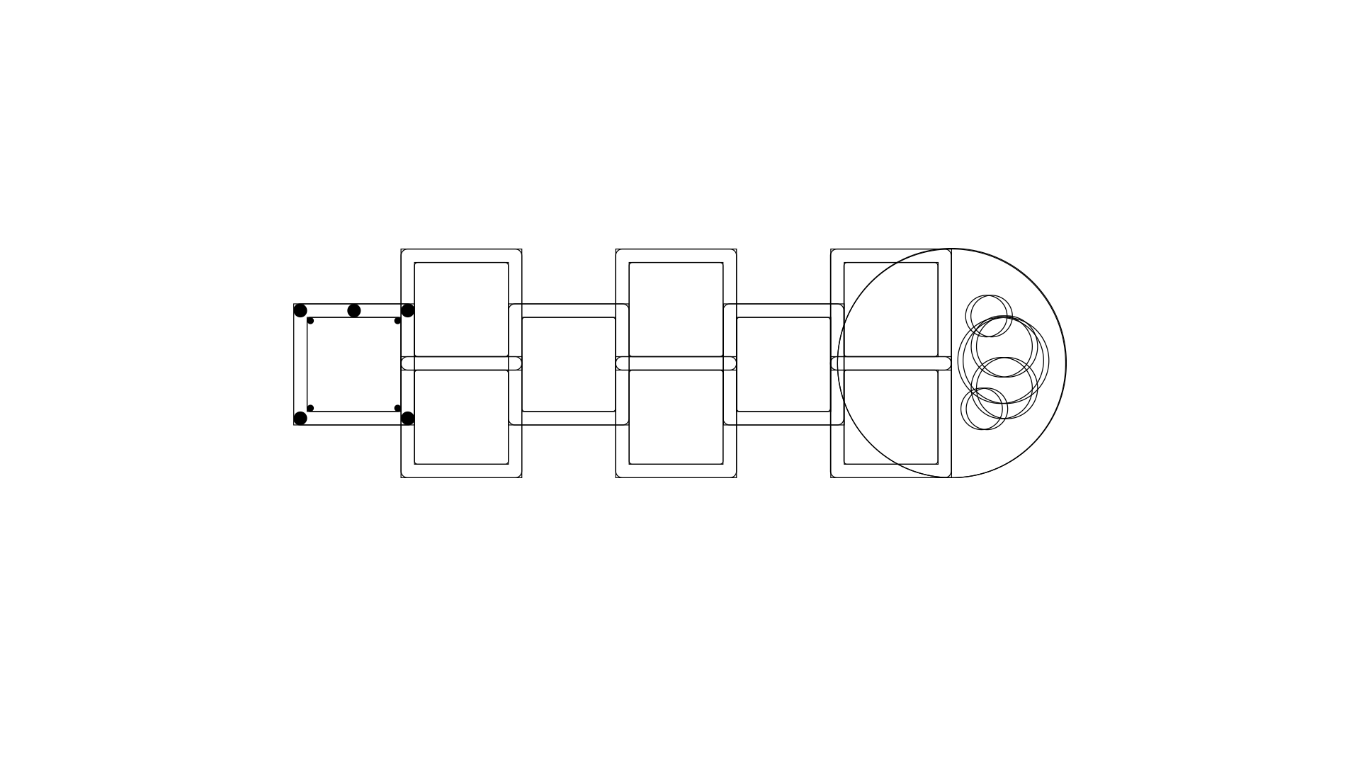
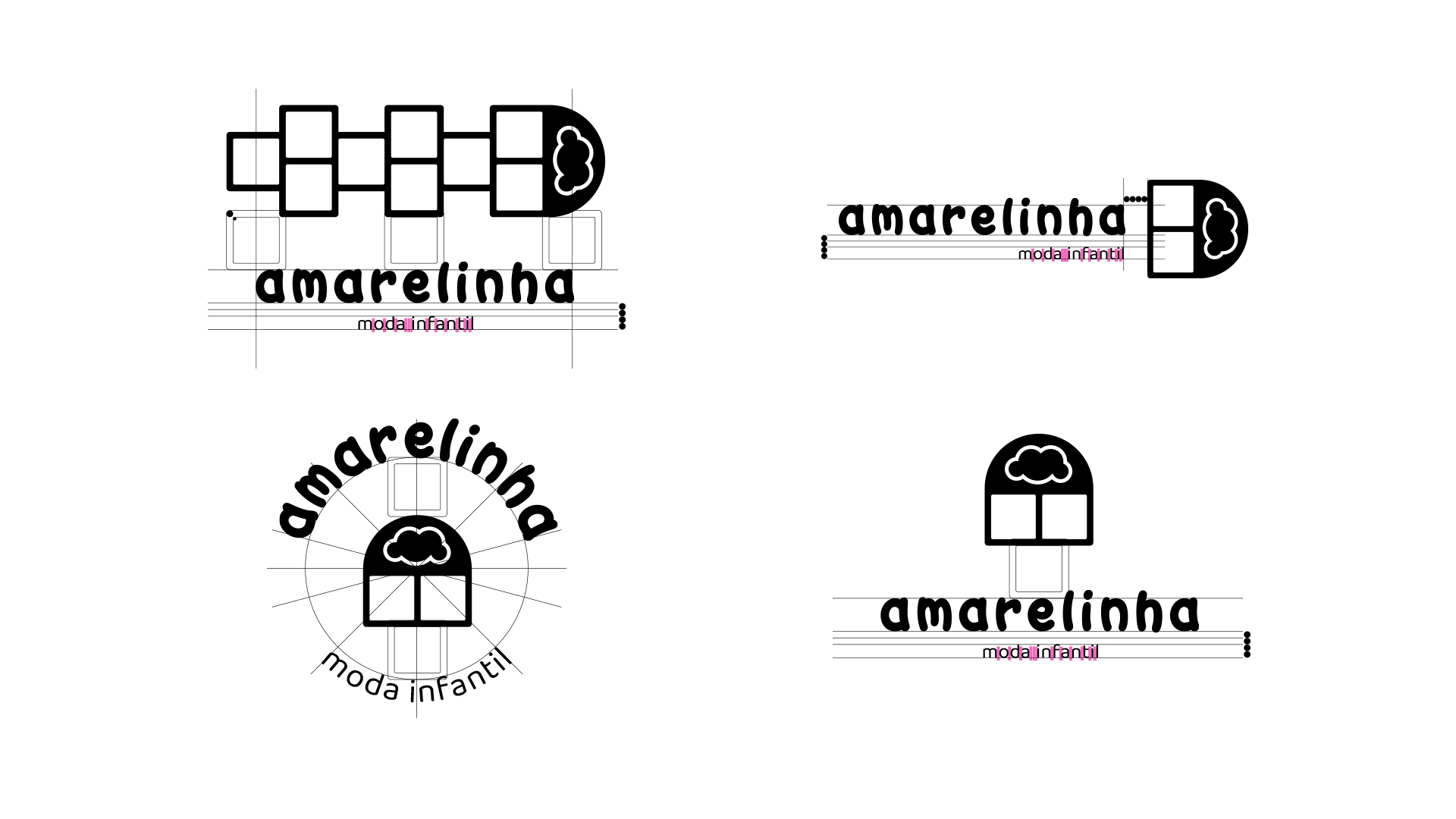
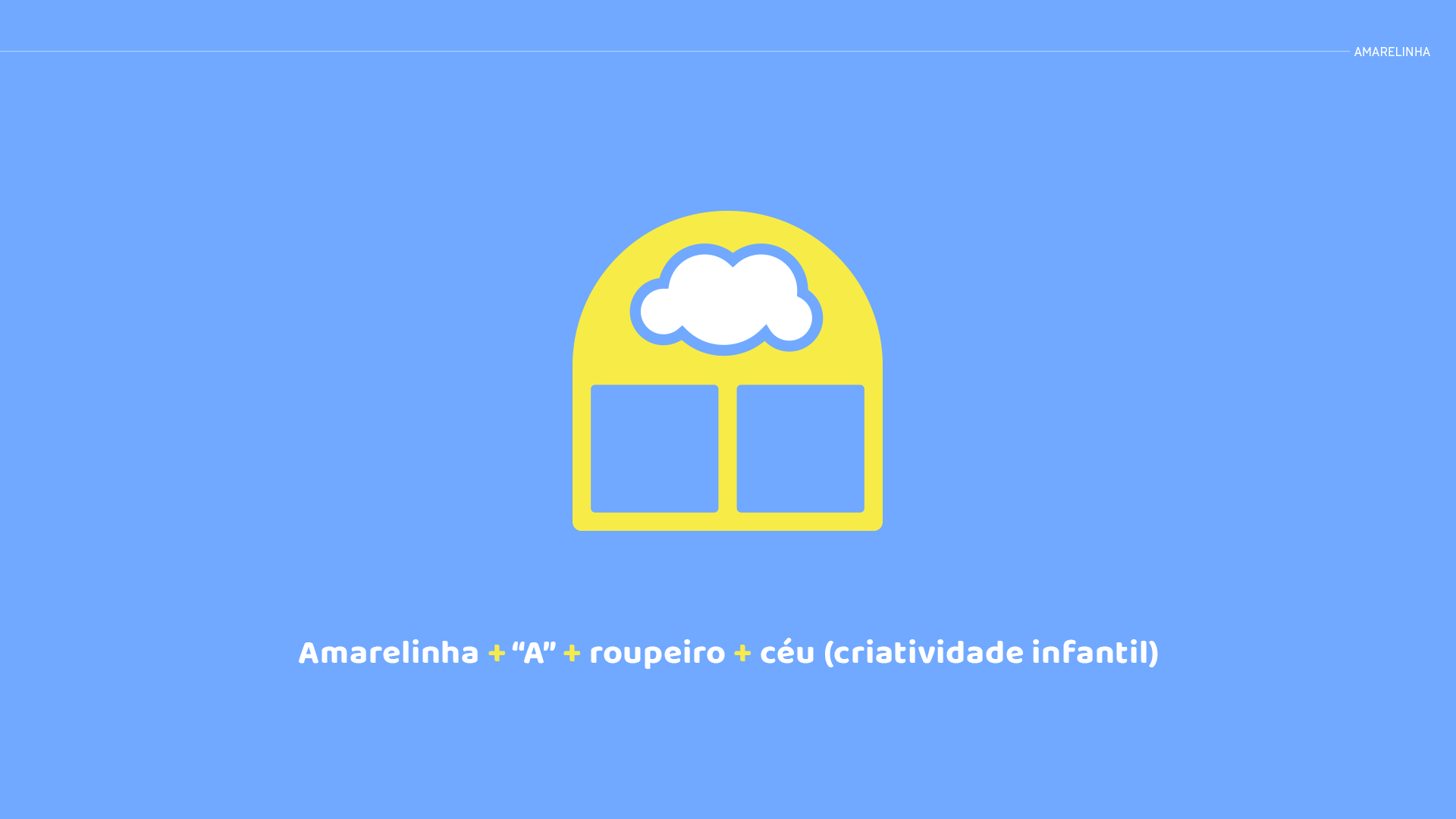
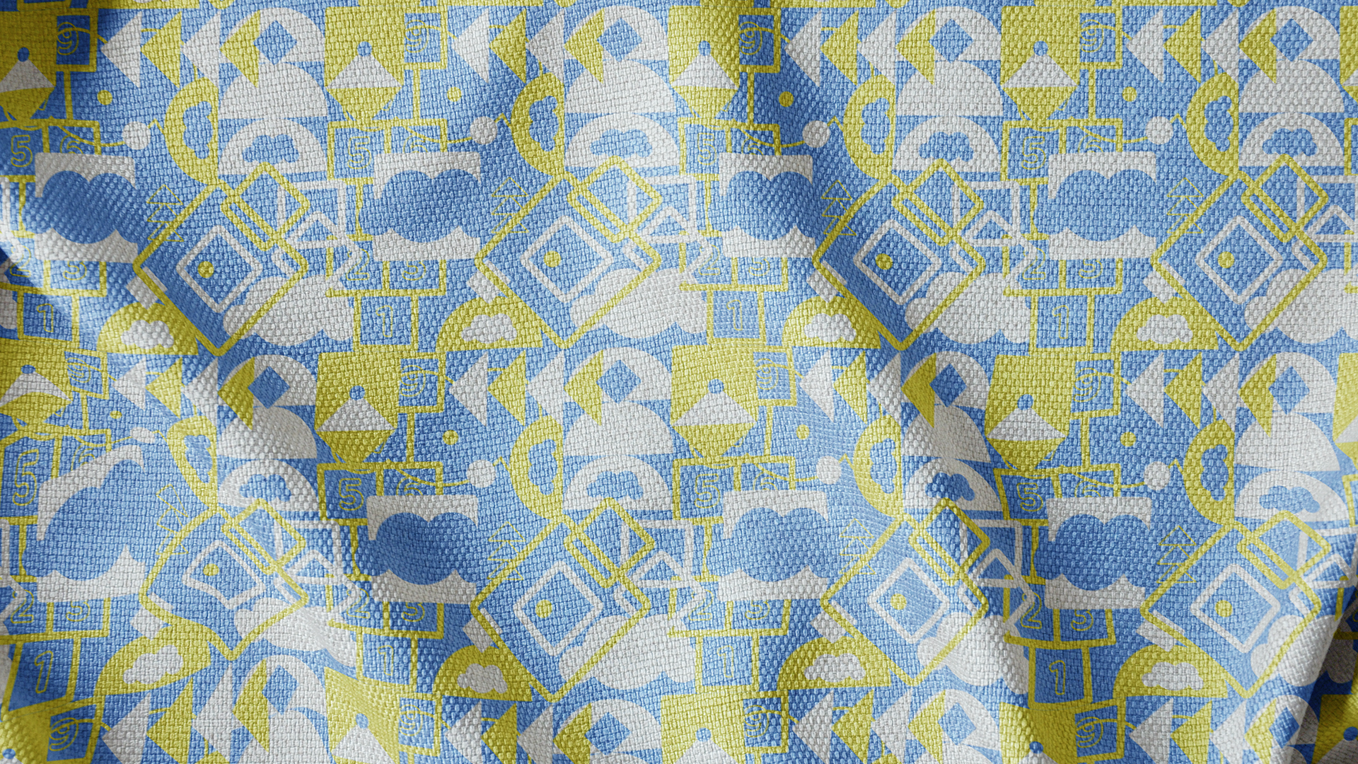
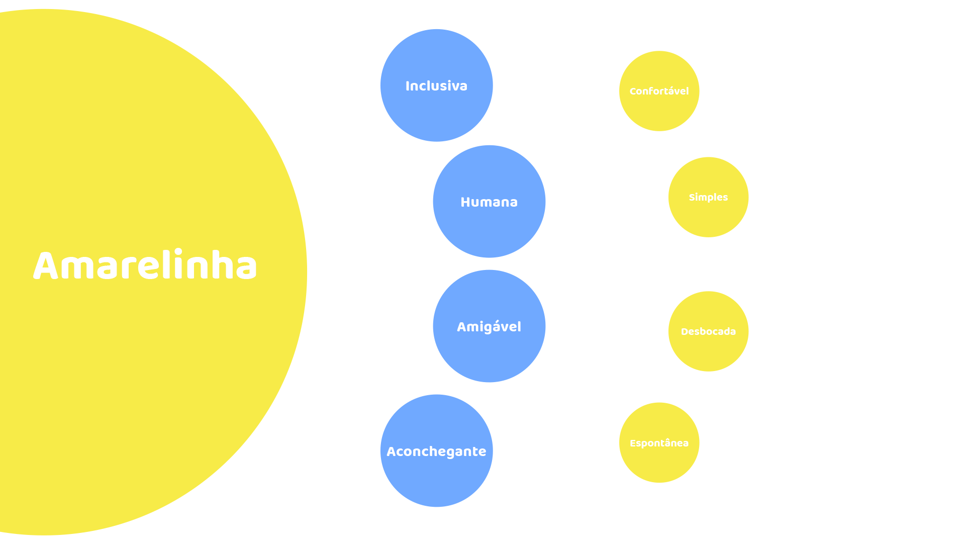
O logotipo da marca foi desenvolvido pensando nisto, com uma tipografia bem estruturada e legível com a utilização de um decodificador e símbolo representativo.A marca brinca com as cores e usa fontes amigáveis para trazer conforto e senso de amizade às crianças.
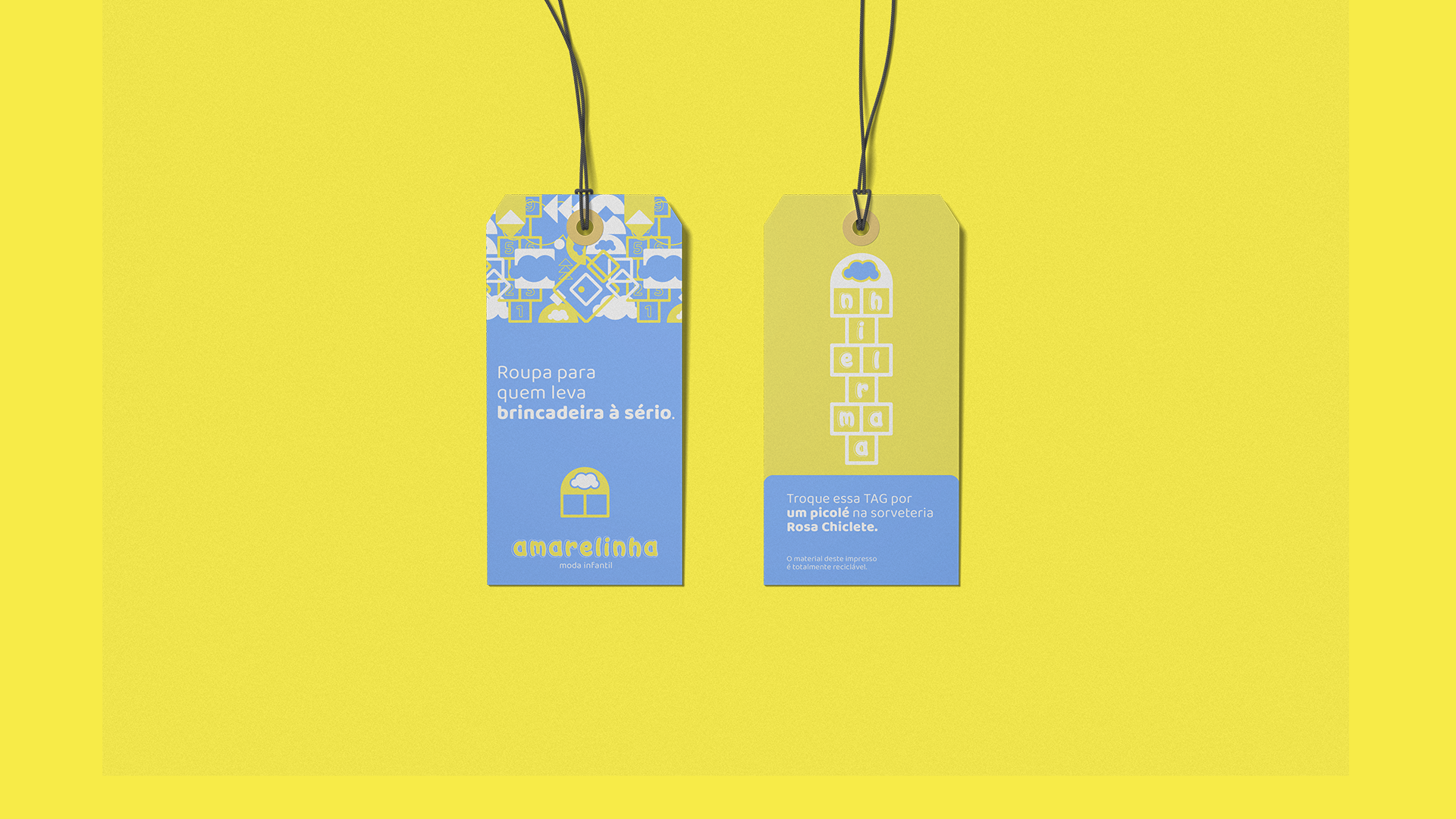
A principal tipografia do naming busca representar os escritos em giz feitos no chão para indicar os numerais das casas no jogo Amarelinha.
__
EN
Since this is a store that offers products to children, but whose target audience is their parents/guardians, the brand's communication must be placed between these two extremes, bringing clarity about what it is about for adults and presenting fun and good times for the little ones.
The brand logo was developed with this in mind, with a well-structured and legible typography with the use of a decoder and representative symbol.
The brand plays with colors and uses friendly fonts to bring comfort and a sense of friendship to children.The main typography of naming seeks to represent the chalk writings made on the ground to indicate the numerals of the houses in the Amarelinha game.