

Gutenburg - Hamburgueria Artesanal
PT
Para Desafio Kimura da Semana da Identidade Visual, deu-se o tema "Gutenburg", uma hamburgueria artesanal temática de Gutenberg, o criador da prensa de tipos móveis, precursor da impressão. O proprietário é um apaixonado por design e gastronomia que deseja por meio deste empreendimento unir suas duas paixões e atender um público com este mesmo perfil
__
For Kimura's Visual Identity Week challenge, the theme "Gutenburg" was given, a handmade hamburger themed by Gutenberg, the creator of the movable type press, precursor of printing. The owner is passionate about design and gastronomy who, through this project, wants to unite his two passions and serve a public with this same profile.
PT
Com referência direta à Johannes Gutenberg (o criador da prensa de tipos móveis e precursor da Revolução da Imprensa), a marca traz a temática “Tipografia”.
Tendo a proposta de oferecer bons diferenciais e engajar um público específico com um local descontraído e um ambiente acolhedor, a Gutenburg buscava uma marca que representasse bem esses ideais.
Por se tratar de um local que tem com público alvo uma faixa etária que vai dos 17 aos 40, a marca precisaria representar a referência “Gutenberguiana” clássica, mas conjunta à uma pegada contemporânea, a fim de se tornar atrativa.
__
EN
With direct reference to Johannes Gutenberg (the creator of the movable type press and precursor of the Press Revolution), the brand brings the theme “Typography”.
With the proposal to offer good differentials and engage a specific audience with a relaxed place and a welcoming environment, Gutenburg was looking for a brand that represented these ideals well.
As it is a place whose target audience is an age group ranging from 17 to 40, the brand would need to represent the classic “Gutenbergian” reference, but together with a contemporary footprint, in order to become attractive.

PT
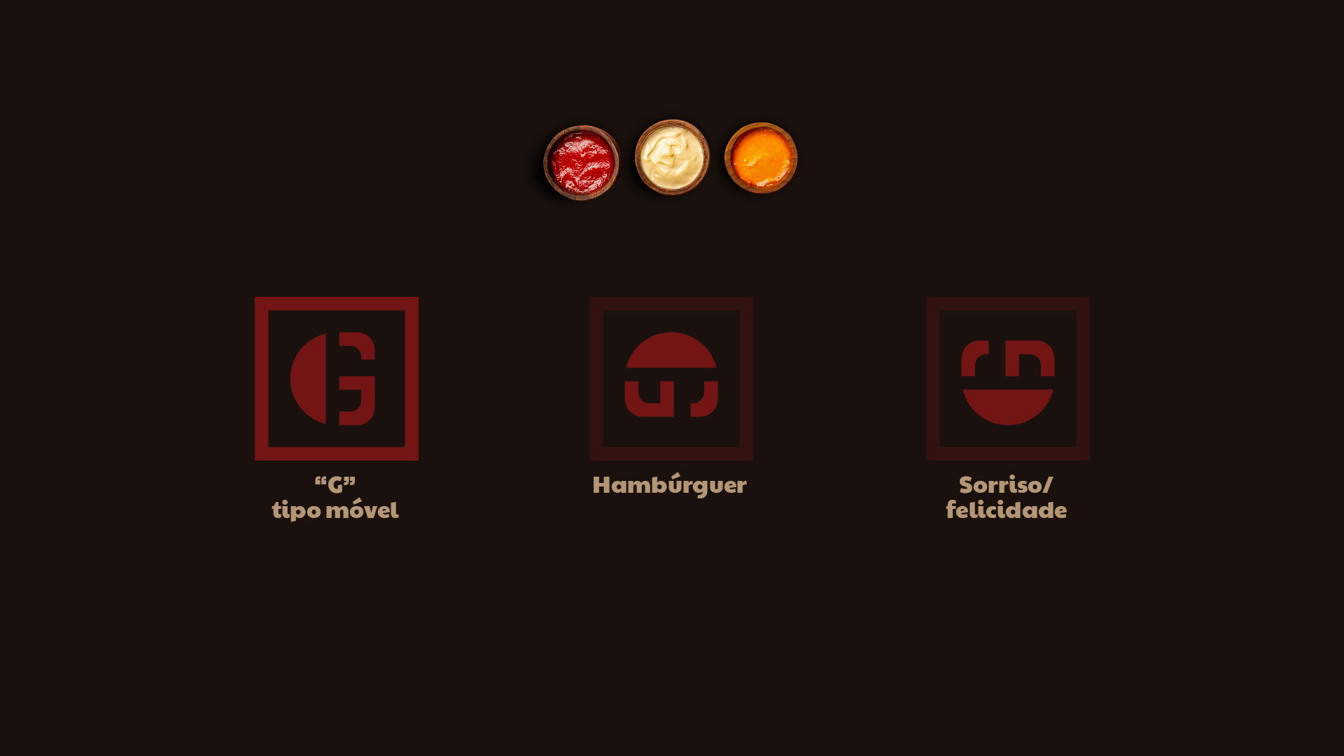
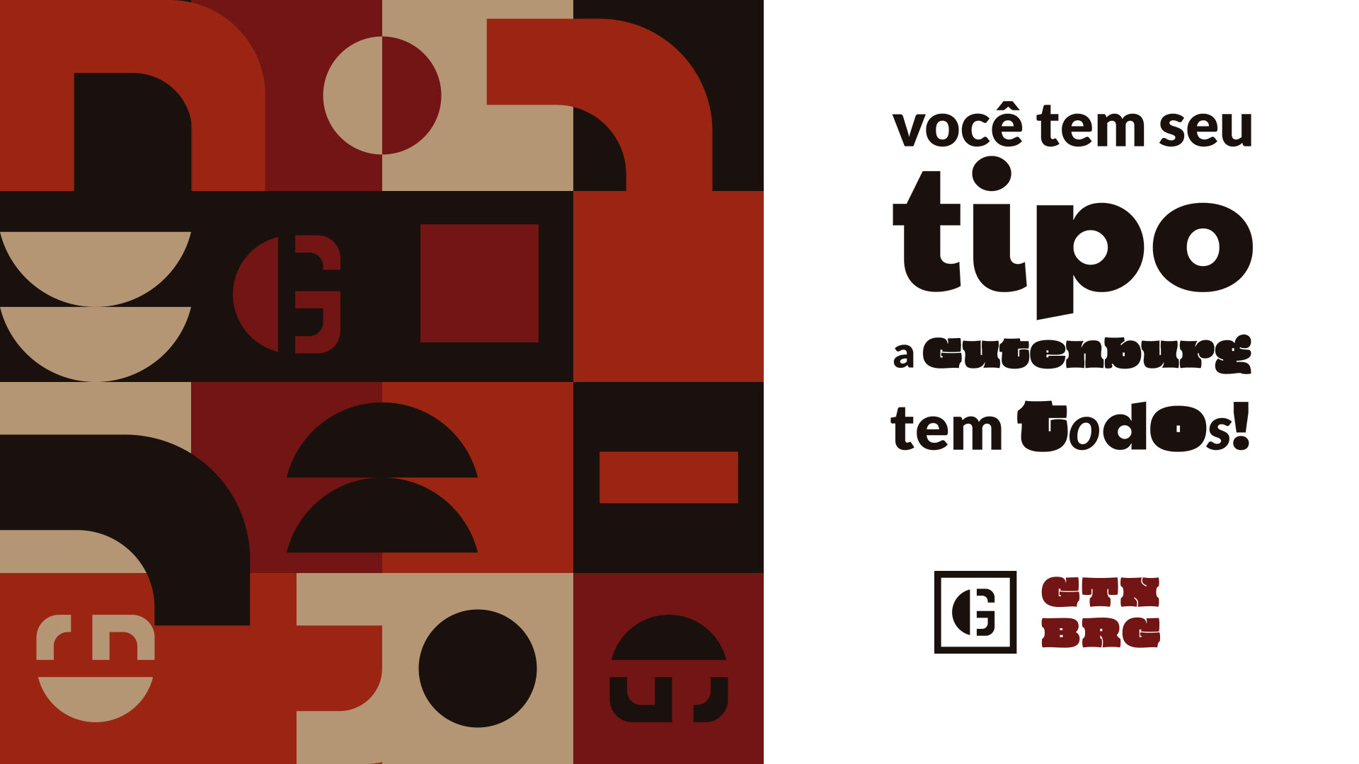
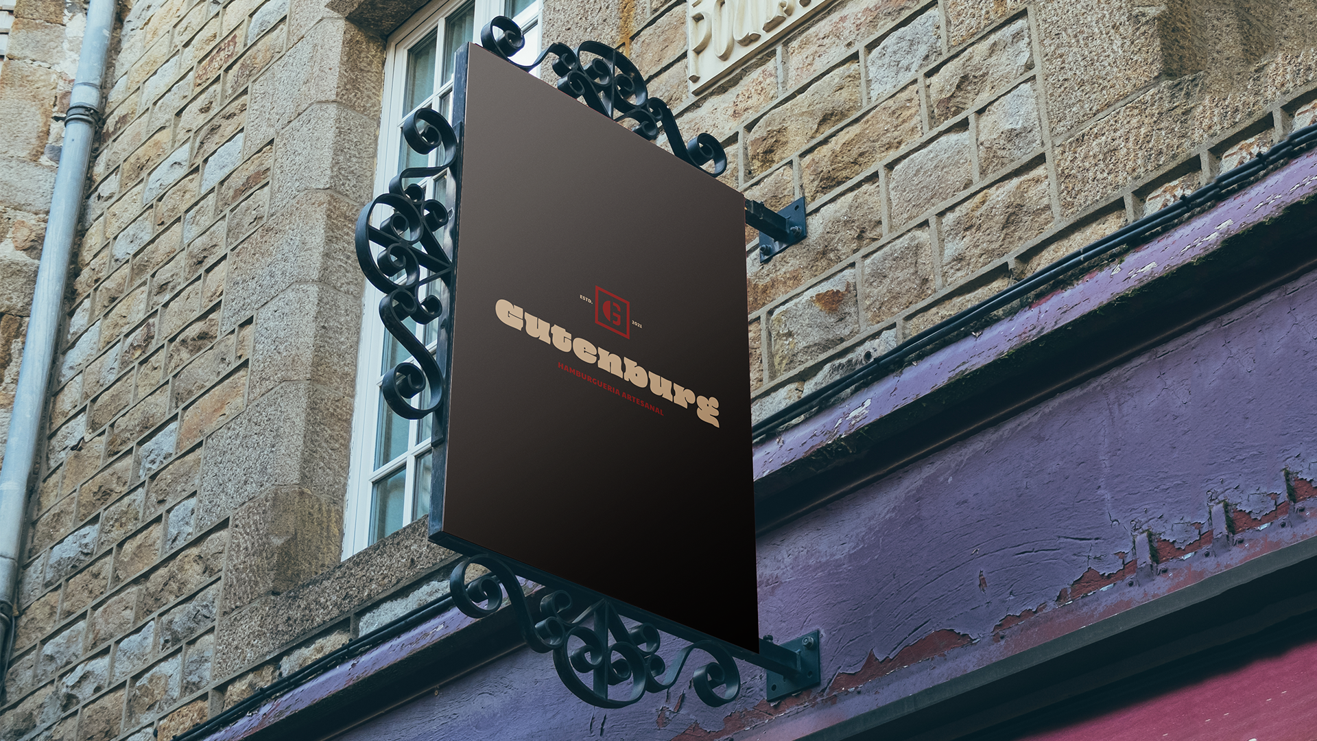
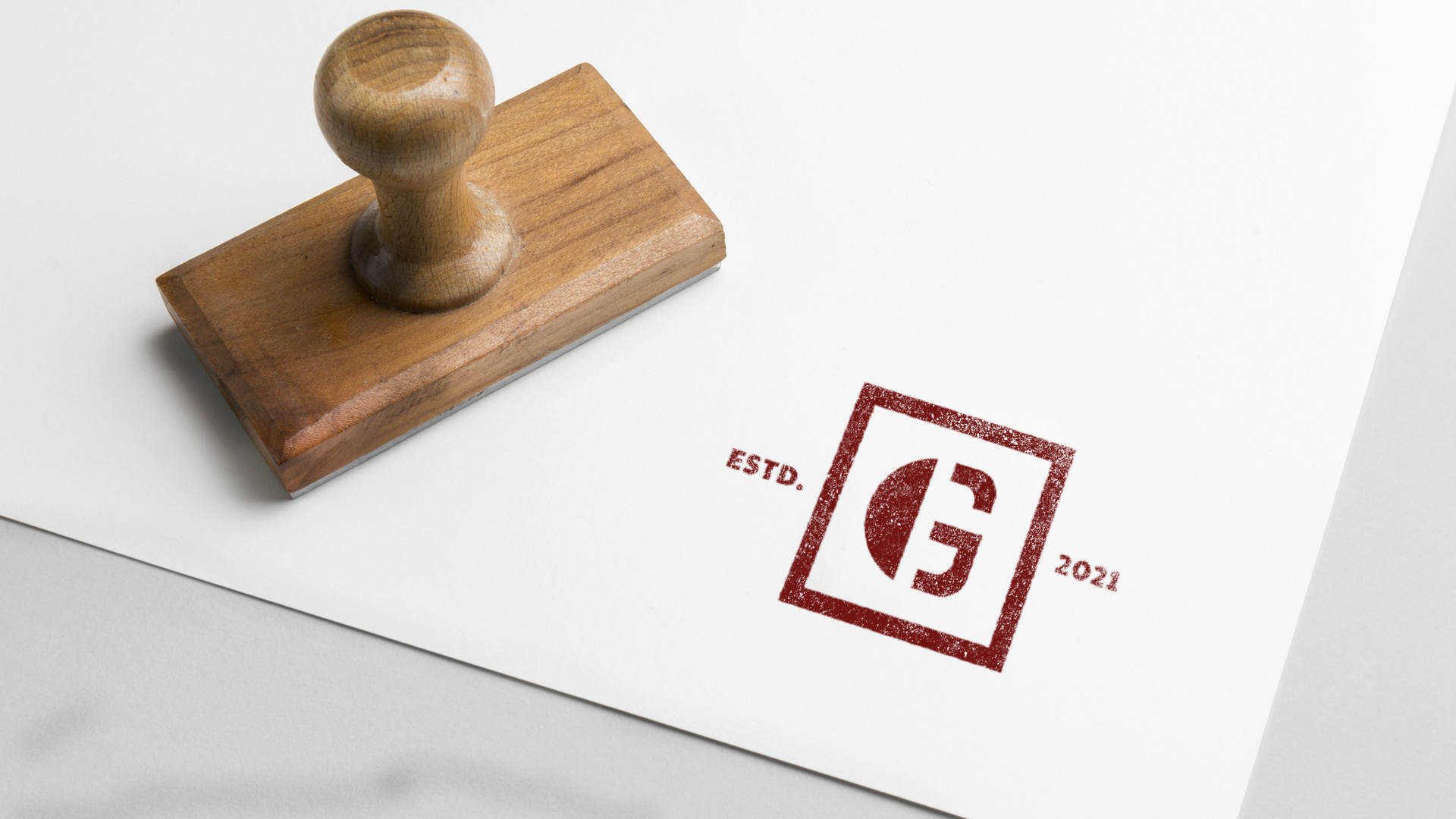
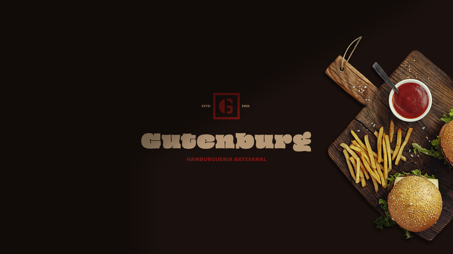
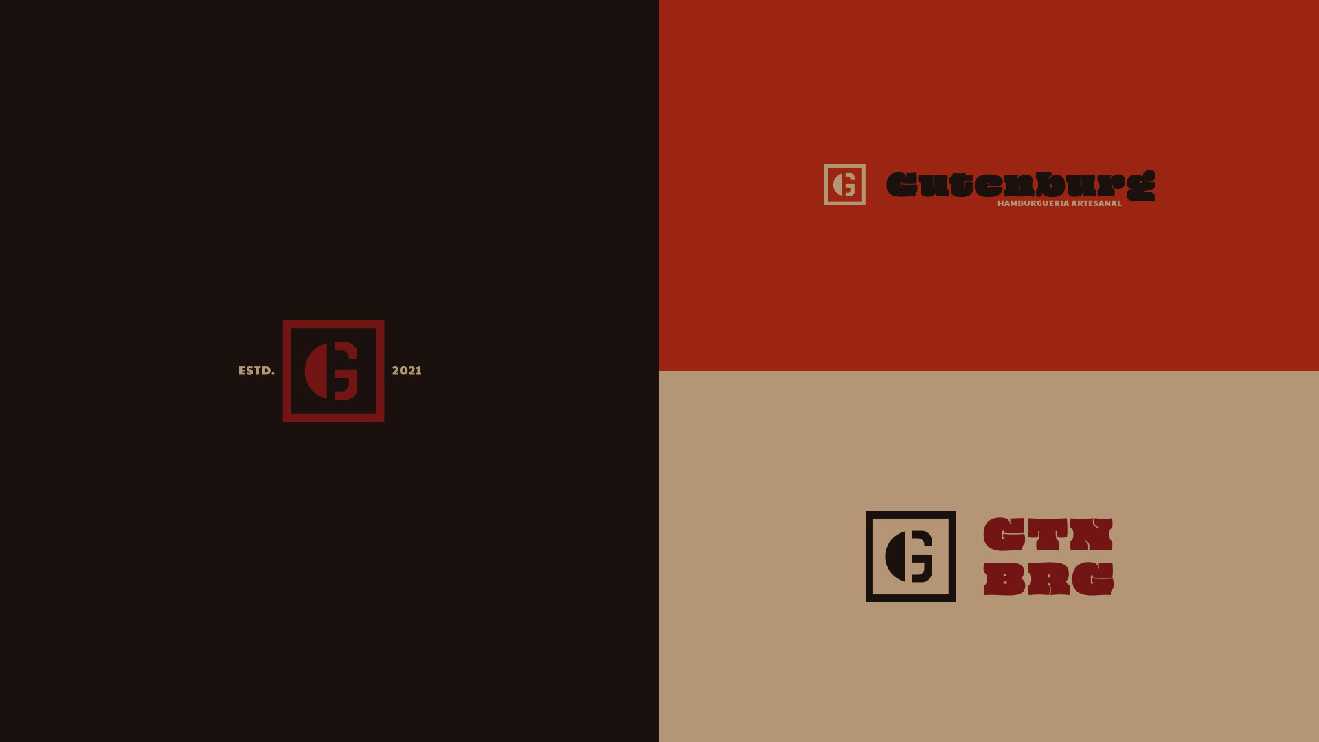
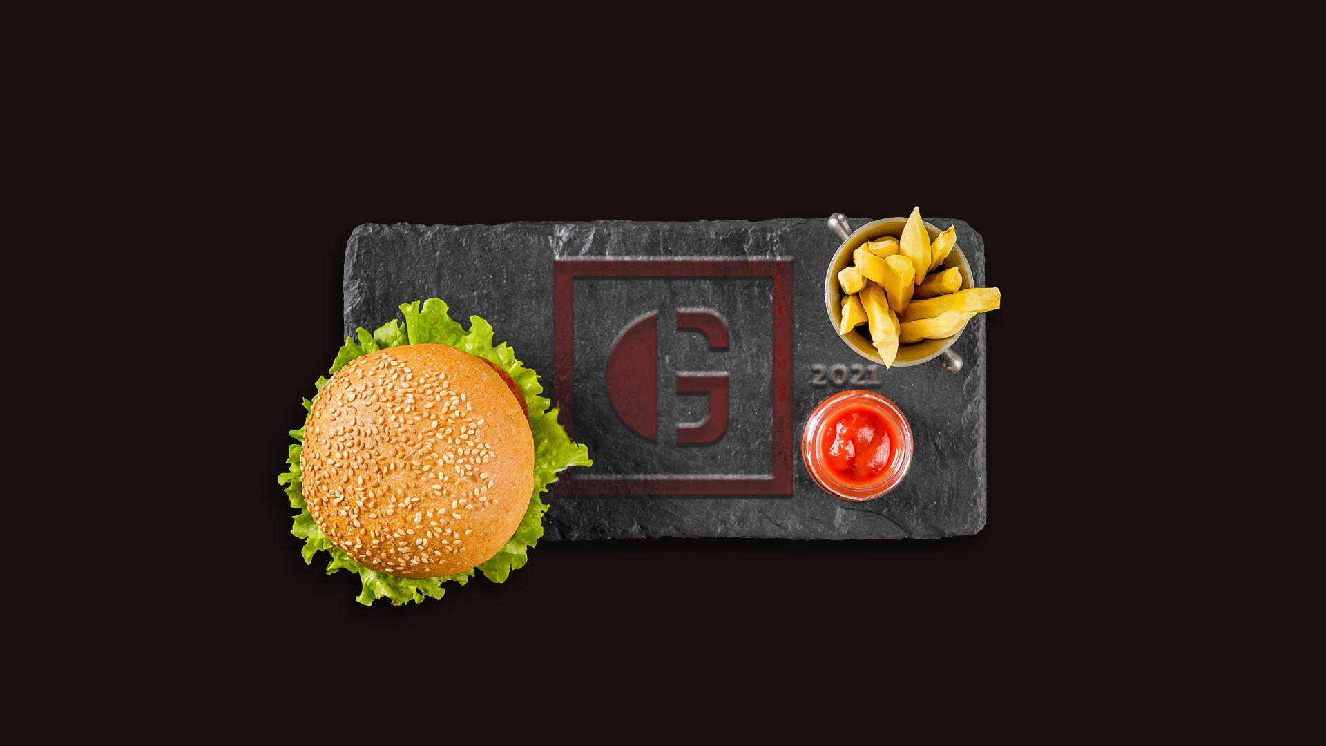
Construiu-se para o logotipo um símbolo que apresenta uma referência aos tipos móveis com a inicial do nome da marca presente. O “G” em forma estêncil reforça essa característica de inserção manual.
Conjunto à isso, podemos vislumbrar em rotação de 90º para a direita, a forma de um hambúrguer, produto principal do estabelecimento e, em rotação 90º para a esquerda, a figuração de um sorriso, representando o humor do local e a proposta em proporcionar alegria à seus clientes.
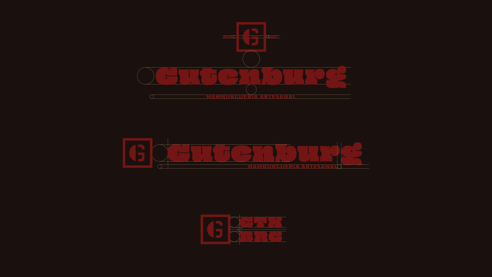
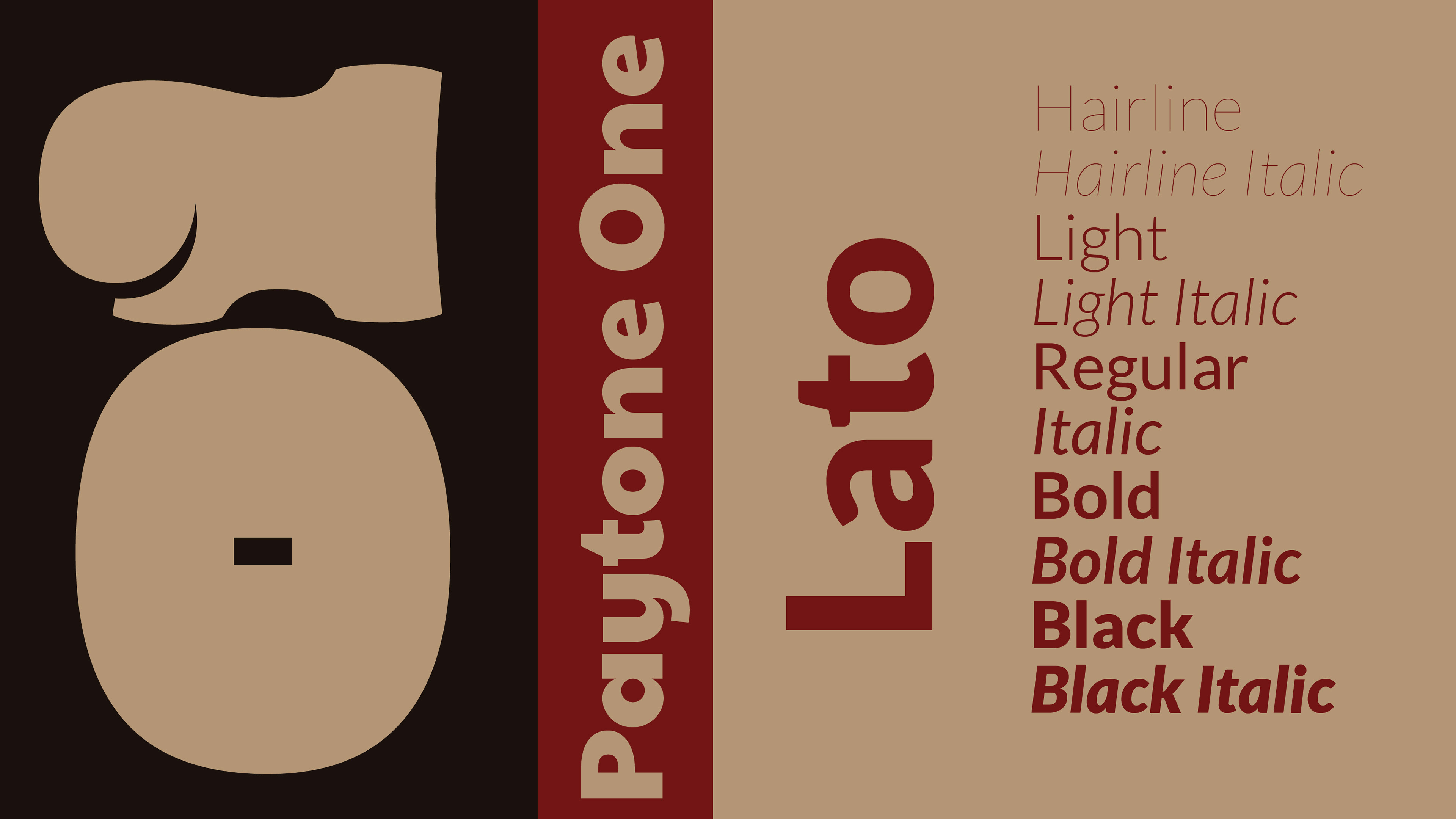
Para a parte tipográfica do logotipo, foram selecionadas duas fontes.
O nome “Gutenburg” é apresentado com a fonte Oi, esta que busca trazer uma forma orgânica e desformalizada, indo de encontro à temática de início da impressão juntamente com a ousadia que a marca busca e fugindo da esperada tipografia gótica que acerca este meio. Jovem, irreverente e ousado.
Na parte do decodificador, a fonte escolhida foi a Paytone One, buscando legibilidade, concordância com sua acompanhante usada no nome do empreendimento e boa estruturação gráfica.
A parte tipográfica da marca é formada pelas duas fontes presentes no logotipo (Oi e Paytone One) e também foi acrescentada para textos a família Lato, trazendo legibilidade para textos grandes e informações essenciais.
__
EN
A symbol was built for the logo that presents a reference to movable types with the initial of the present brand name. The stenciled “G” reinforces this feature of manual insertion.
Together with this, we can see in a 90º rotation to the right, the shape of a hamburger, the main product of the establishment and, in a 90º rotation to the left, the figuration of a smile, representing the mood of the place and the proposal to provide joy to your customers.
For the typographic part of the logo, two fonts were selected.
The name “Gutenburg” is presented with the Oi font, which seeks to bring an organic and deformalized form, meeting the theme of the beginning of printing together with the boldness that the brand seeks and fleeing from the expected Gothic typography that surrounds this medium. Young, irreverent and daring.
In the decoder part, the chosen font was Paytone One, seeking readability, agreement with its companion used in the name of the enterprise and good graphic structure.
The typographic part of the brand is formed by the two fonts present in the logo (Oi and Paytone One) and was also added for texts in the Lato family, bringing legibility to large texts and essential information.
PT
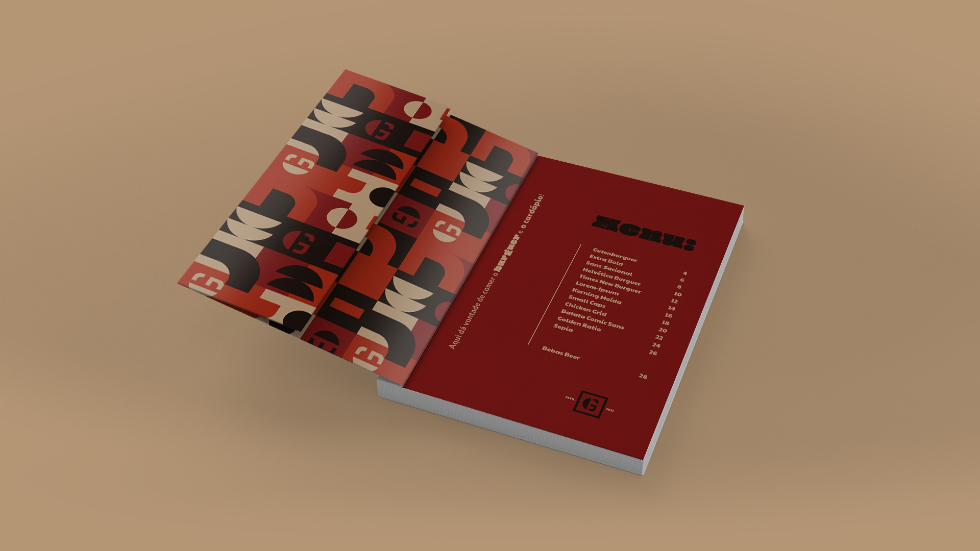
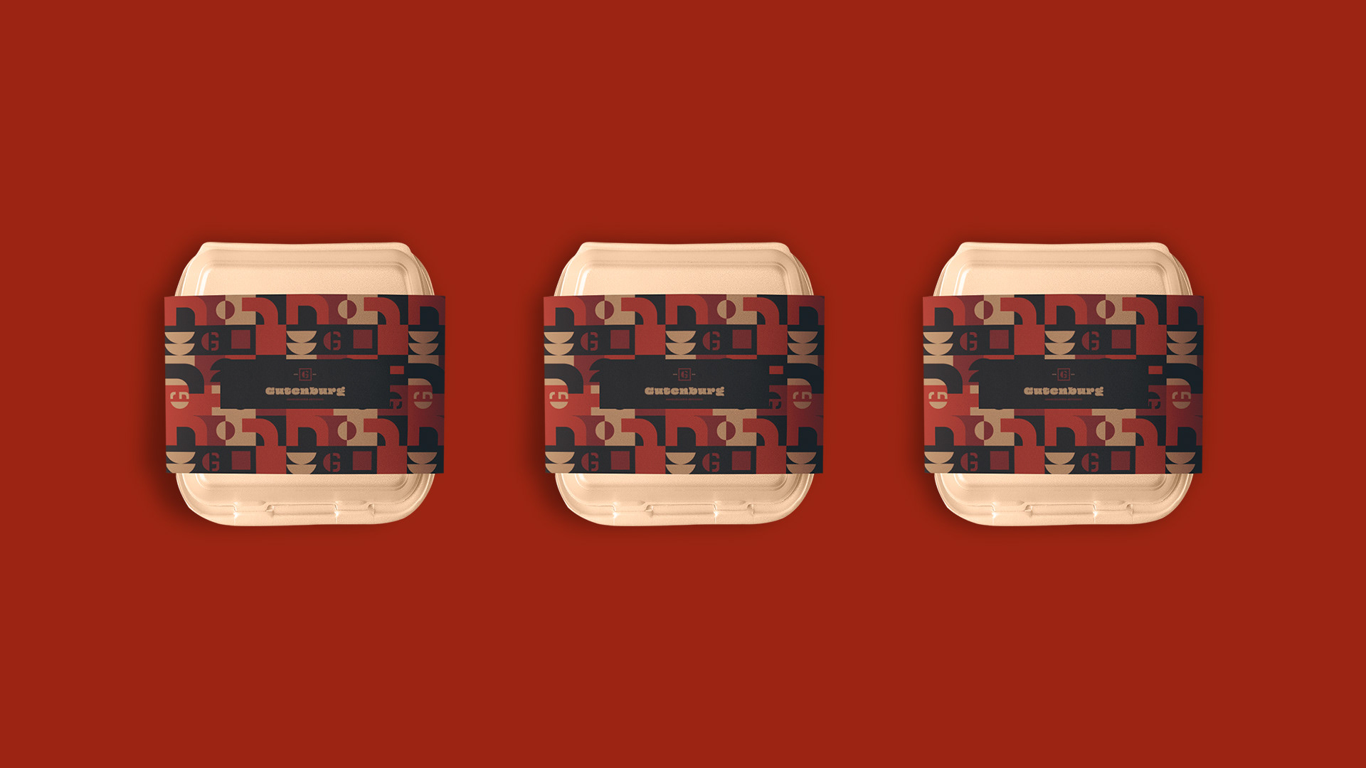
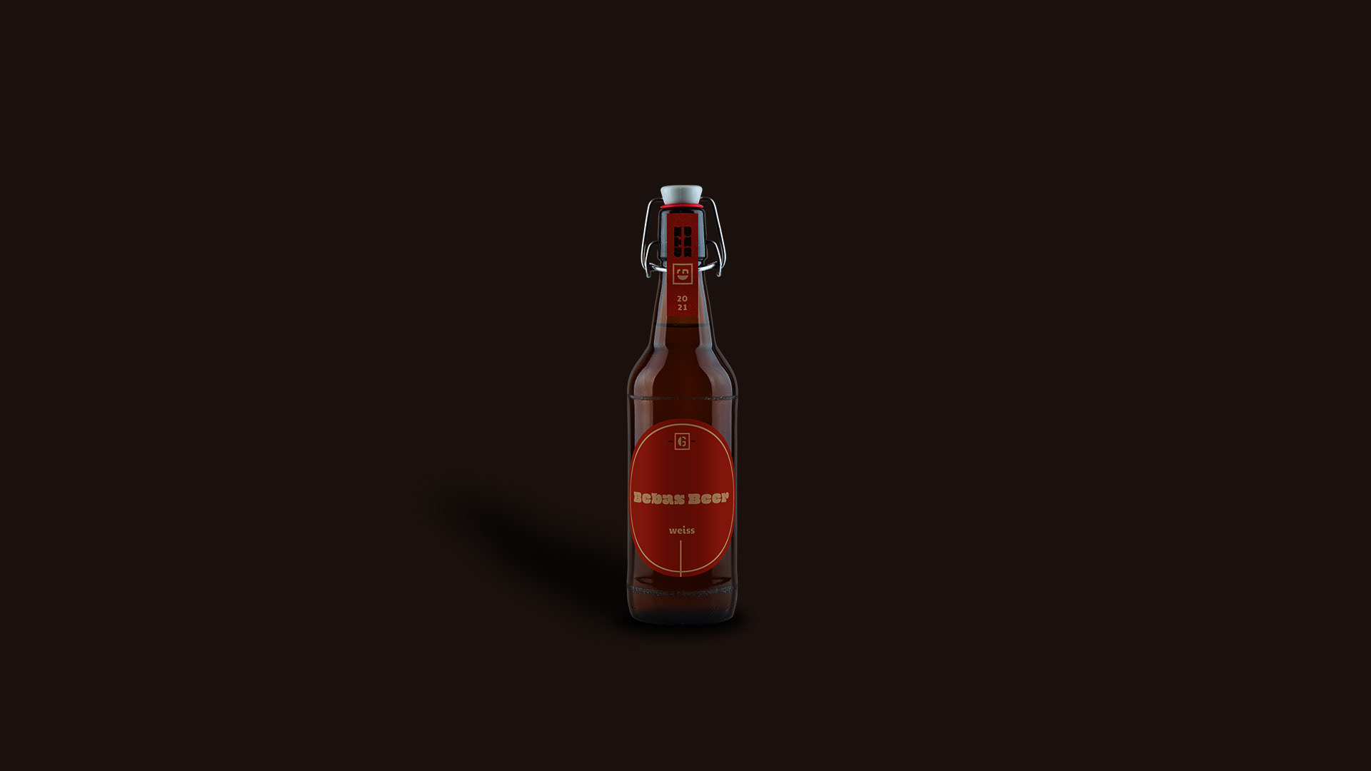
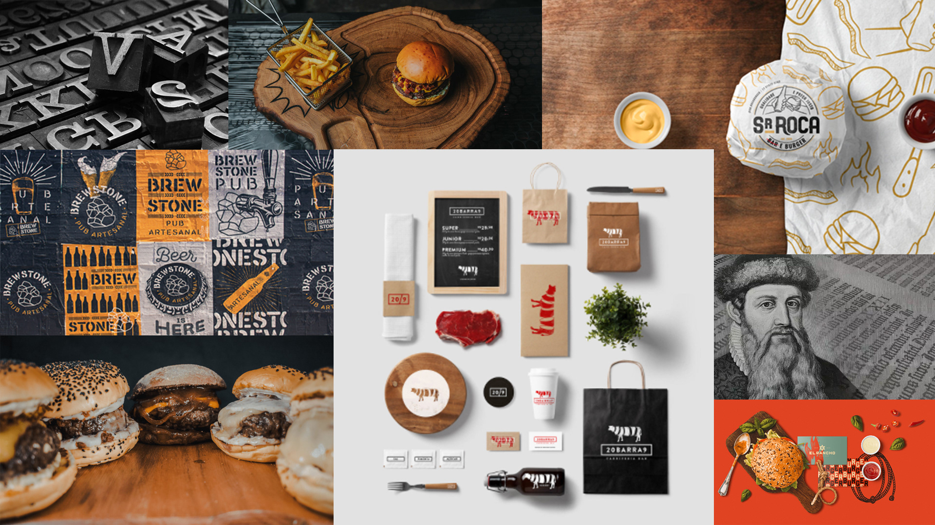
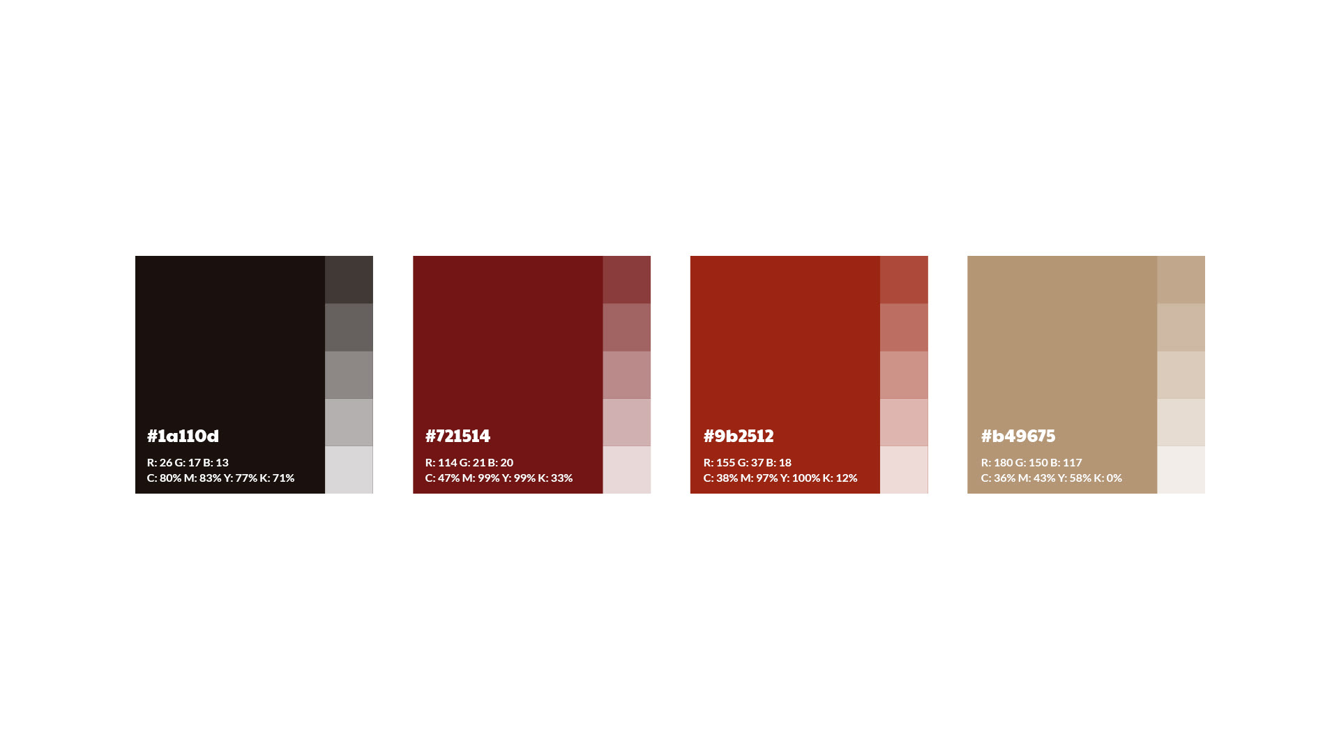
A paleta de cores escolhida foi retirada através do moodboard construído para a concepção do projeto, com representações aos hambúrgueres, pães, bebidas e molhos, trazendo uma cara autêntica , ousada, jovem e irreverente.
__
EN
The chosen color palette was taken from the moodboard built for the project's conception, with representations of hamburgers, breads, drinks and sauces, bringing an authentic, daring, young and irreverent face.

PT
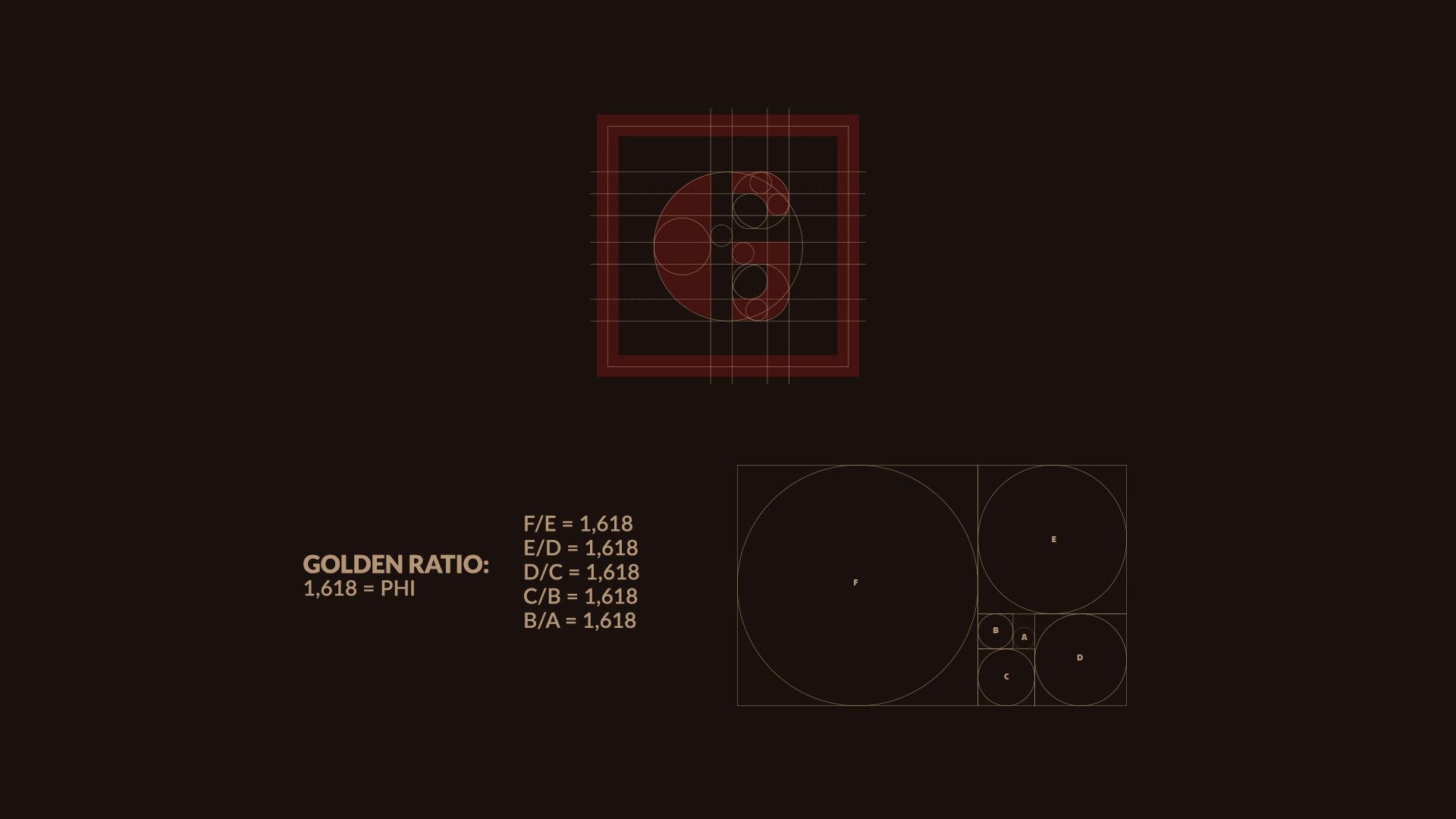
A construção do grid deu-se com uso de proporção áurea.
Foram usados círculos e quadrados áureos para o desenvolvimento do símbolo e também para diagramação do conteúdo do logotipo trazendo uma justificação bem trabalhada para a marca.
__
EN
The construction of the grid took place using the golden ratio.Golden circles and squares were used for the development of the symbol and also for the layout of the logo's content, bringing a well-crafted justification for the brand.