
Tá na chapa!
PT
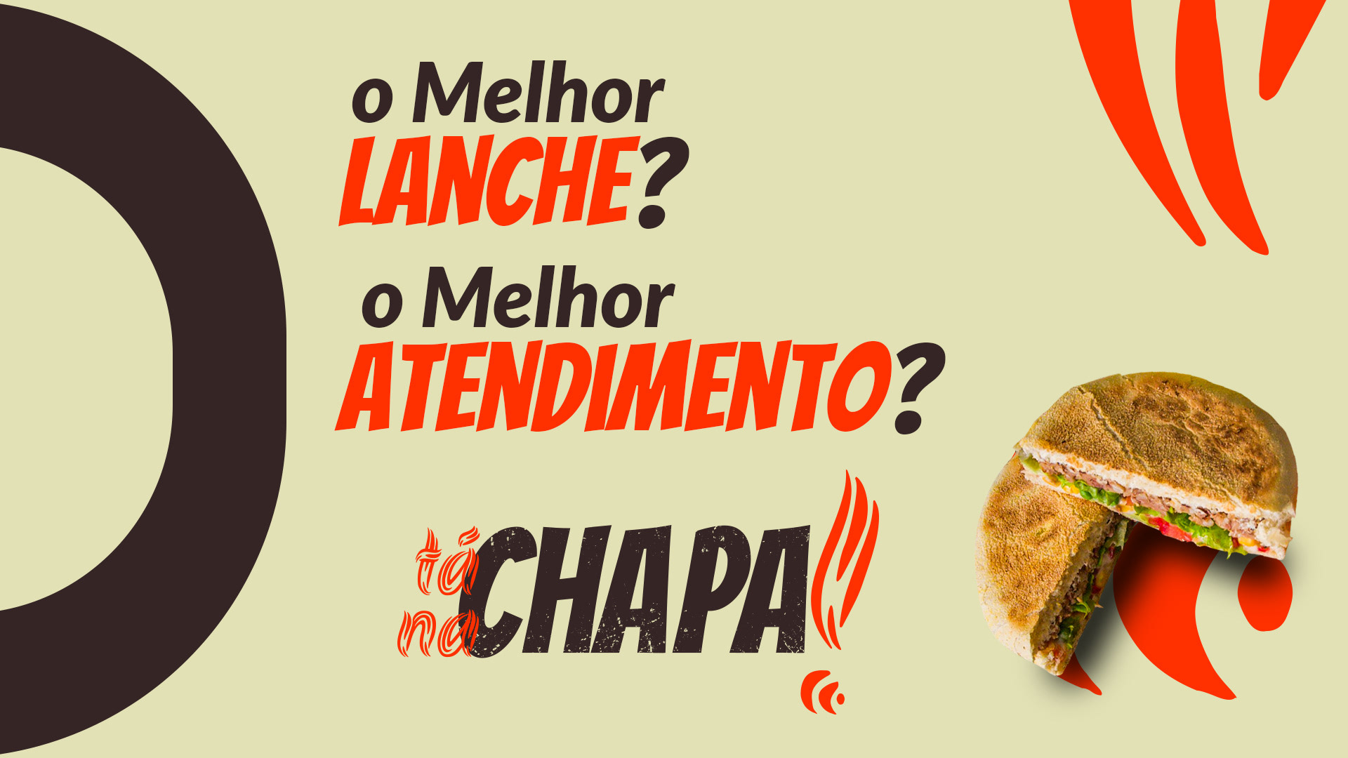
“Tá na chapa!” é uma lancheria que tem como proposta oferecer os melhores lanches e o melhor atendimento de Butiá, diferenciando-se de seus concorrentes por buscar sempre oferecer o melhor produto ao cliente, desde o pedido até a degustação de seus lanches.
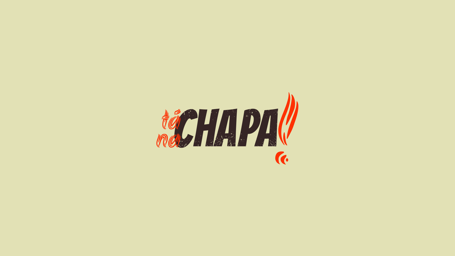
O nome passado em briefing seria de “Tá na chapa”, porém me arrisquei em propor um “!” para alavancar força e autenticidade ao logotipo, além de proporcionar elementos de apoio da identidade visual.
__
EN
"Tá na Chapa!" is a snack bar whose proposal is to offer the best snacks and the best service in Butiá, differentiating itself from its competitors by always seeking to offer the best product to the customer, from ordering to tasting their snacks.
The name given in the briefing would be "Tá na chapa", but I took the risk of proposing a "!" to leverage strength and authenticity to the logo, in addition to providing visual identity support.
PT
Com uma referência ao local onde são feitos a maior parte dos lanches, o nome “Tá na chapa!” traz um tom forte e característico, além de apresentar fácil memorização.
Em briefing foi destacado algumas vezes a busca pela qualidade dos produtos e atendimento da empresa.
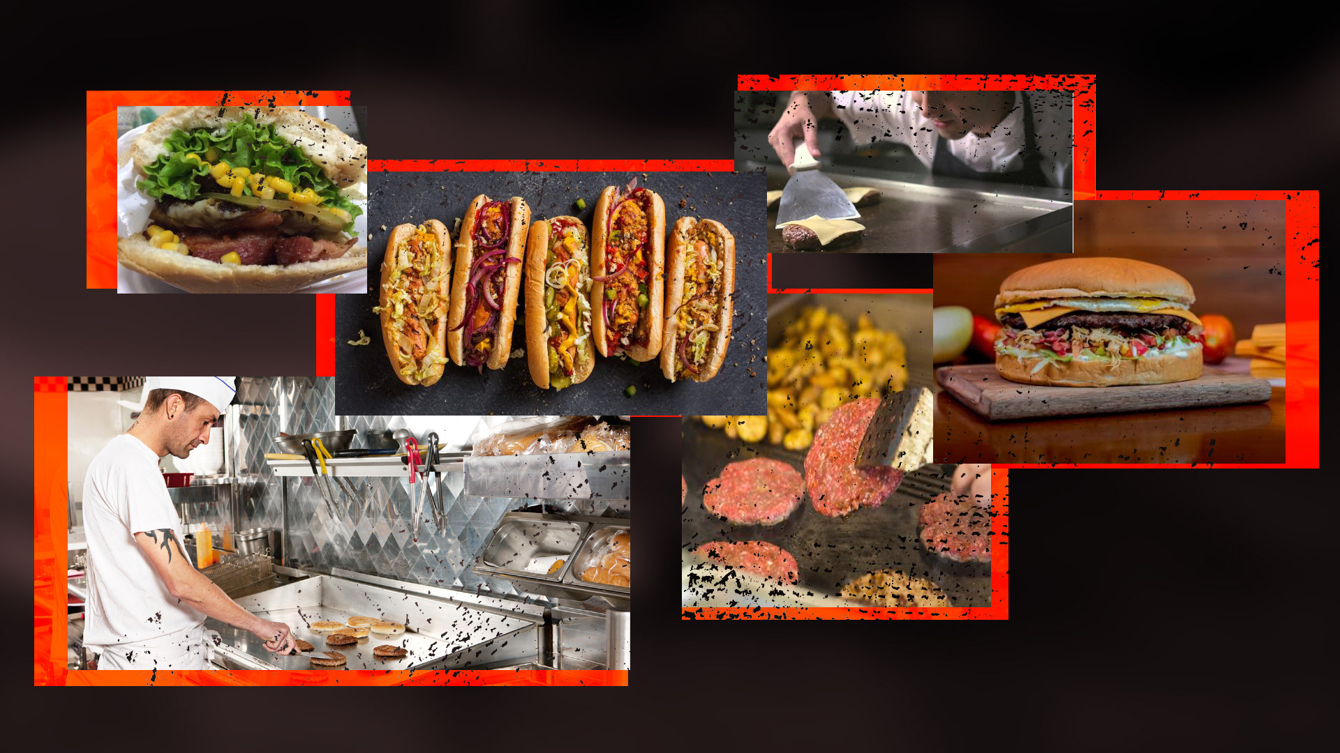
Após leitura e interpretação das respostas, iniciou-se um processo de imersão no tema, buscas por, principalmente, cozinhas de lancherias, acompanhando fotos e vídeos dos processos das mesmas.
Foi montado um painel semântico contemplando alimentos, cozinhas e vestimentas características deste meio, para que assim o projeto fosse desenvolvido com verdadeiros significados, porém mantendo sua originalidade.
Diversos rascunhos foram elaborados para a idealização de uma solução ideal para o bom funcionamento da marca com seus ideais e público alvo.
__
EN
With a reference to the place where most snacks are made, the name "Tá na chapa!" brings a strong and characteristic tone, in addition to being easy to memorize.
At a briefing, the search for the quality of the company's products and service was highlighted a few times.
After reading and interpreting the answers, a process of immersion in the theme began, searching mainly for snack kitchens, following photos and videos of their processes.
A semantic panel was set up contemplating food, kitchens and clothing characteristic of this medium, so that the project could be developed with true meanings, while maintaining its originality.
Several drafts were prepared to idealize an ideal solution for the proper functioning of the brand with its ideals and target audience.

PT
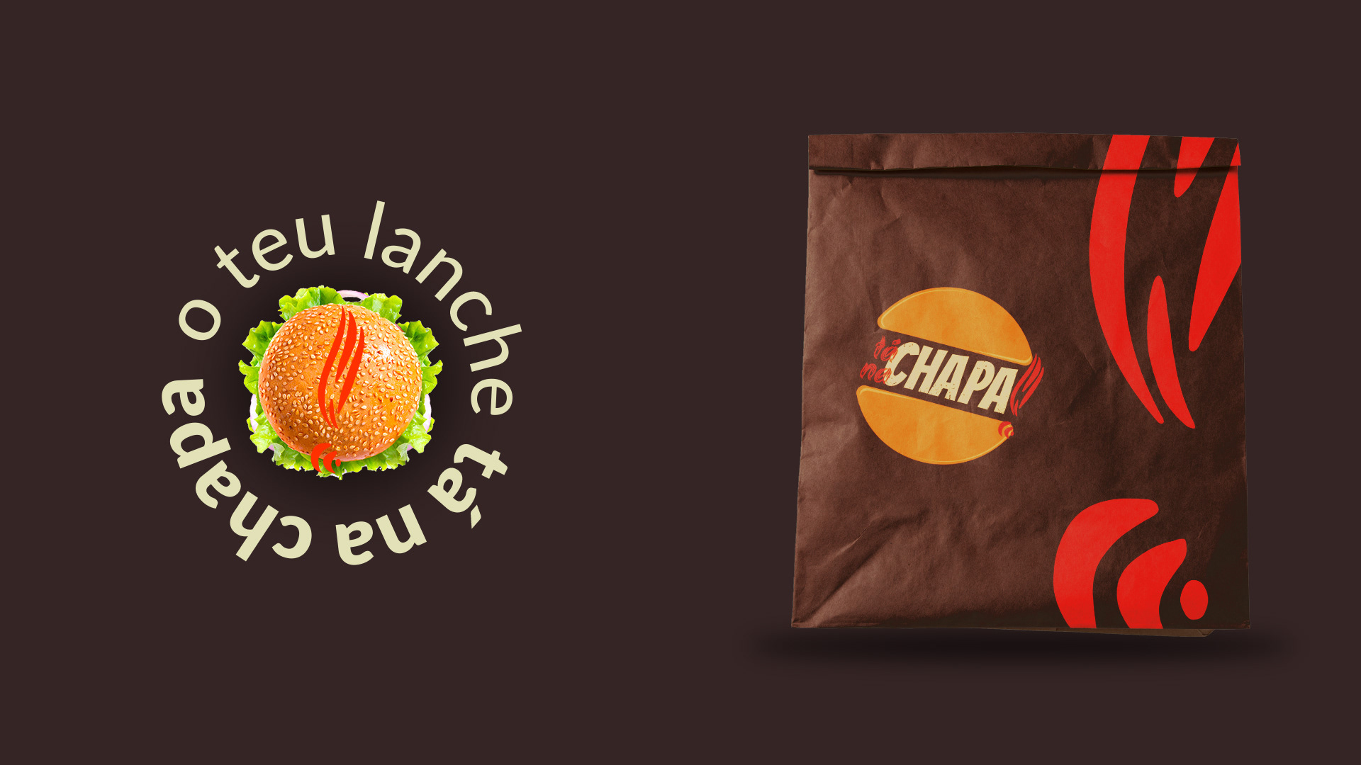
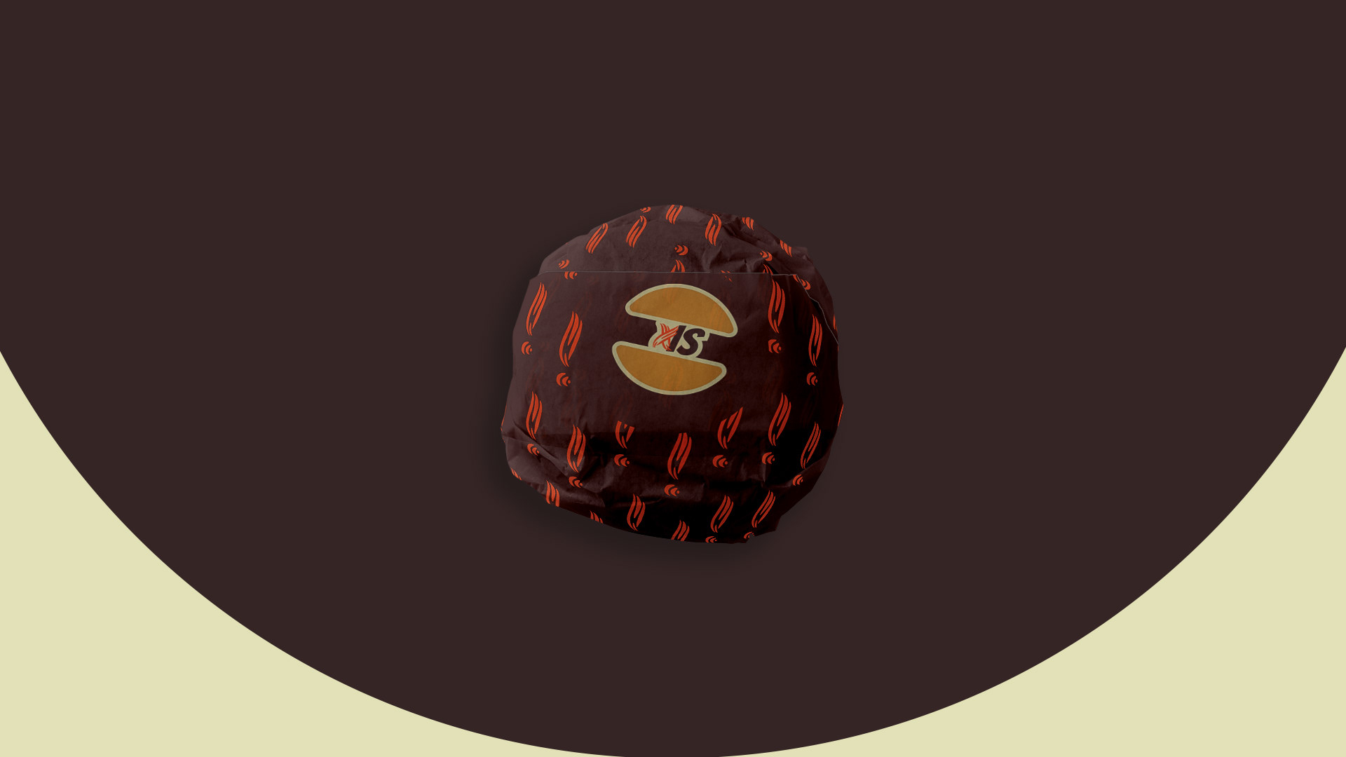
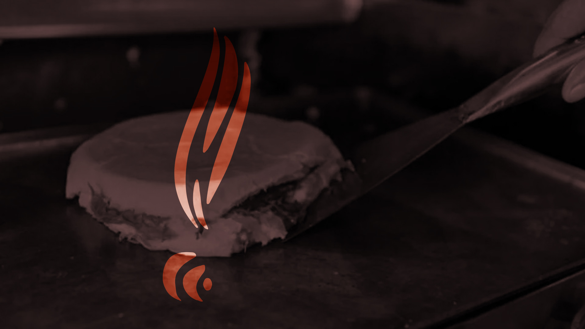
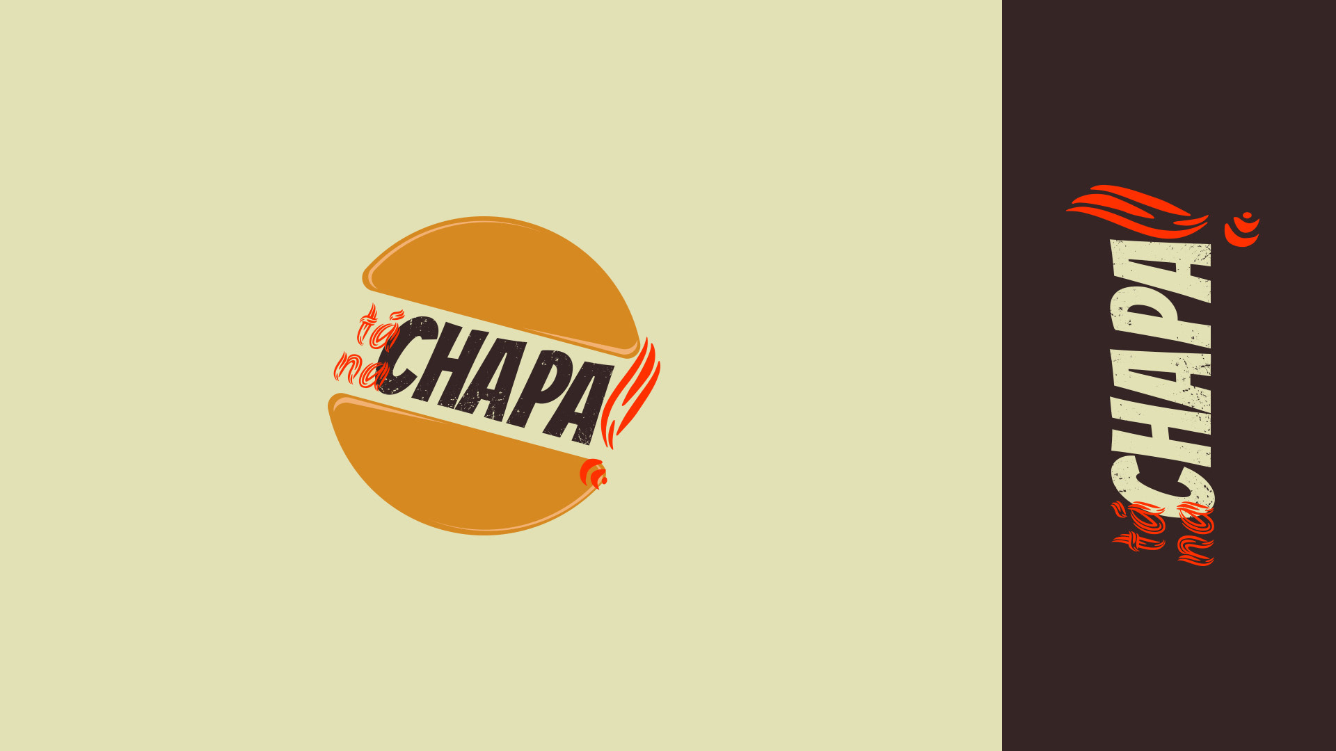
O “pão” foi escolhido para fazer parte do logotipo, buscando referenciar de forma direta o que é oferecido pela empresa.
De forma circular e com bordas arredondadas este símbolo busca ser convidativo e demonstrar confortabilidade aos clientes. Foi inserido um efeito de “reflexo” para deixar o logo mais interativo e não “chapado” com o fundo.
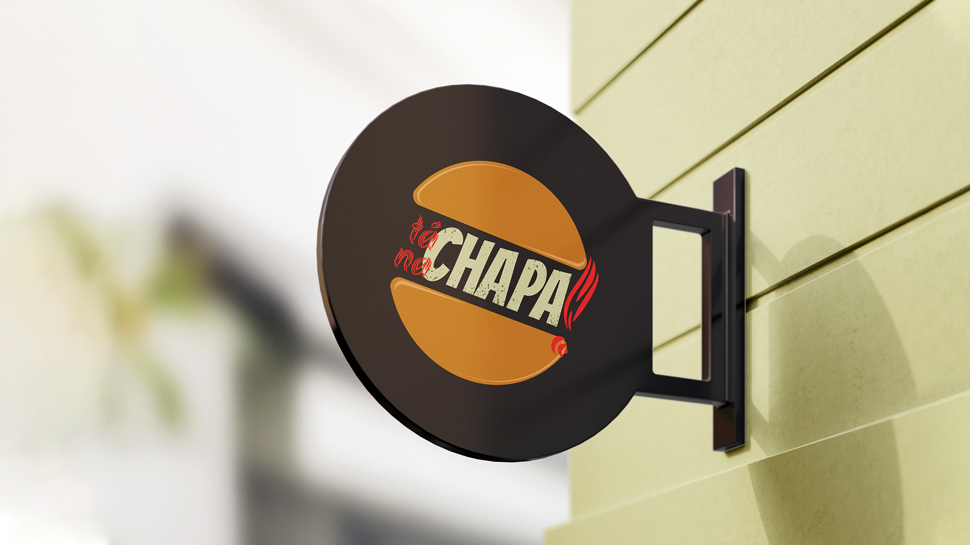
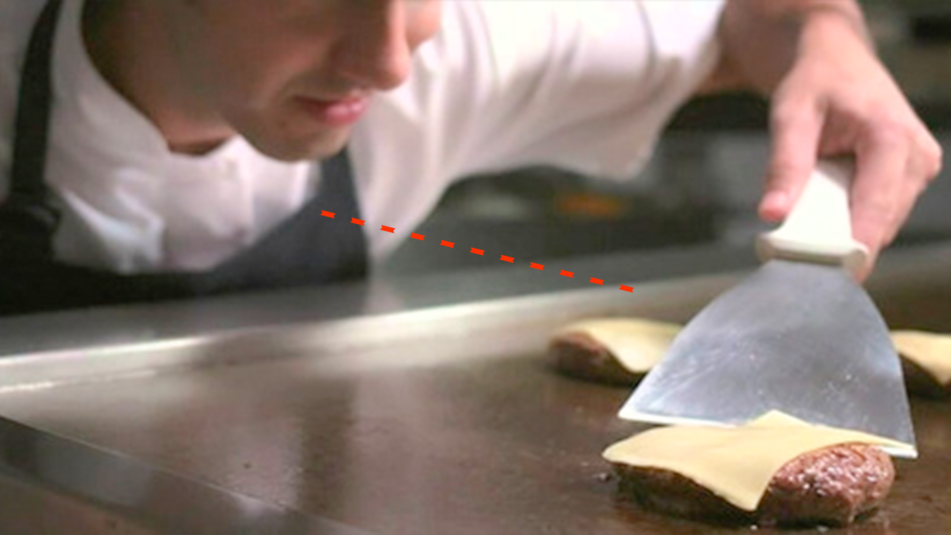
Na versão com símbolo, o logo circular sofreu uma rotação em 15º trazendo carisma, autenticidade e soando convidativo à quem o visualiza. A inclinação tem como inspiração a linha de visão do “chapeiro” para a chapa. Esta angulação busca também representar a forma em que comemos o lanche direto “na mão”, sem o auxílio de garfo e faca, modo esse que é de grande gosto, um “prazer simples” da maior parte das pessoas, aproximando assim empresa e clientes.
__
EN
The “bread” was chosen to be part of the logo, seeking to directly reference what is offered by the company.
With a circular shape and rounded edges, this symbol seeks to be inviting and demonstrate comfort to customers. A “reflection” effect was added to make the logo more interactive and not “flat” with the background.
In the version with a symbol, the circular logo underwent a 15º rotation, bringing charisma, authenticity and sounding inviting to the viewer. The inclination is inspired by the line of sight from the “platemaker” to the plate. This angle also seeks to represent the way in which we eat the snack directly "by hand", without the aid of a knife and fork, which is in great taste, a "simple pleasure" for most people, thus bringing the company and customers closer .


PT
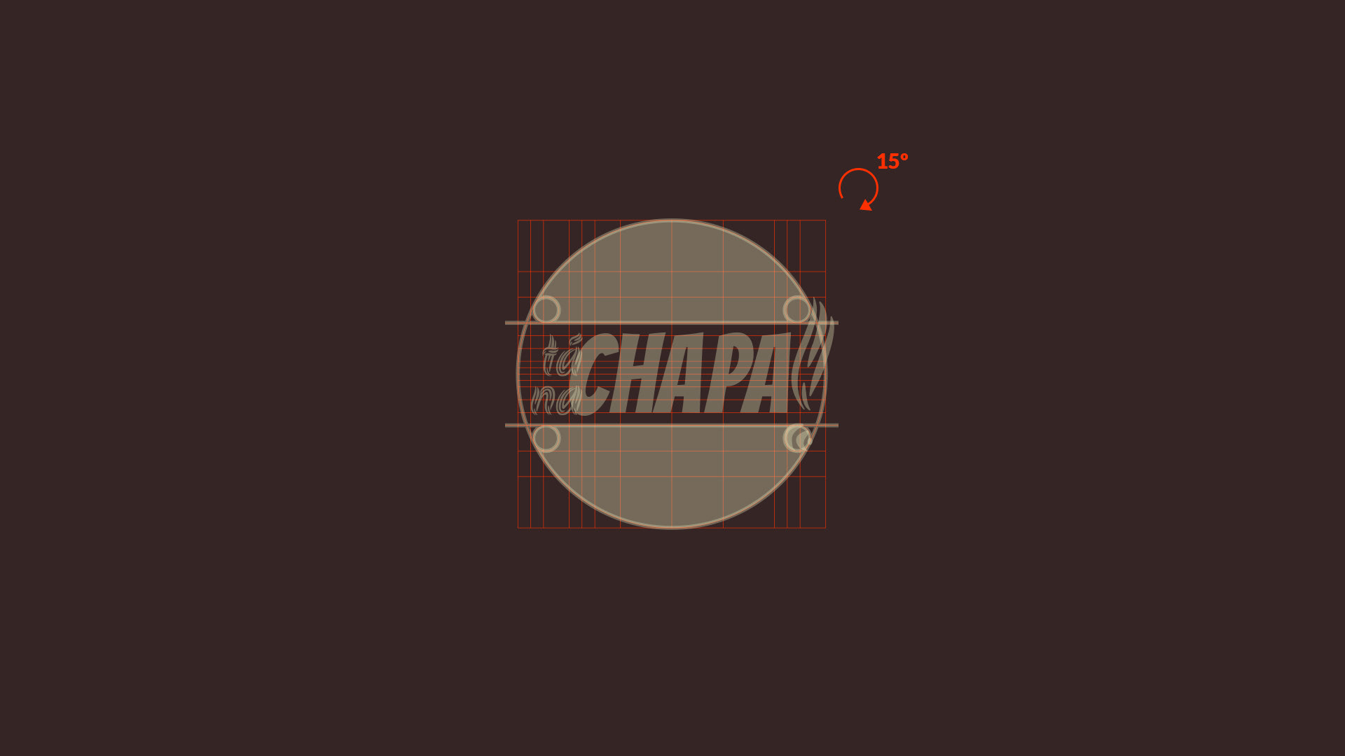
A construção deu-se através de um grid modular, a fim de assegurar os itens do logotipo e manter alinhamentos com justificativas.
De forma simples e eficaz os elementos foram posicionados, alinhados e acrescidos usando deste grid detalhado.
__
EN
The construction took place through a modular grid, in order to ensure the logo items and maintain alignments with justifications.
In a simple and efficient way the elements were positioned, aligned and added using this detailed grid.